At some point in the past year I really got into blackjack. If you think you’ll ever find yourself in a casino with time to kill, this is a great game to know and if you memorize some basic strategy rules you can reduce the casino edge to only 0.25%. Earlier this year, I set out to do just that, but the problem I ran into is that most blackjack strategy charts out there are some of the worst examples of information graphics in existence.
Existing Charts
Garish colors, poorly thought out layouts and just plain bad design. See the following screenshot of a Google image search:
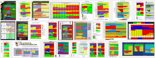
Yuck.
Rather than mistreat my delicate designer eyes by staring at these things, I decided to design my own. Softer colors, more meaningful abbreviations, and clear division of sections were quick changes that made a big difference in readability. If you are well-versed in blackjack, then skip straight down to the design dissection section.
How blackjack works (in a nutshell)
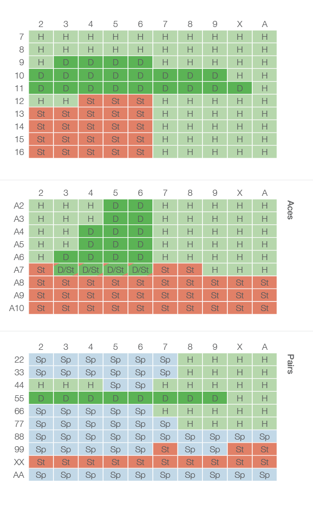
I’ll attempt to explain just enough about blackjack here so you understand the design choices, but I’d encourage you to check out the game in more depth elsewhere because it’s great fun when you know how. You play against the dealer (not others at your table) and you attempt to get as close to 21 without going over. The key thing to know about blackjack when looking at the chart is: you are dealt 2 cards face up and the dealer is dealt 2 cards with just one facing up. Depending on the combination of the sum of your cards (shown down the side) and the dealers up card (across the top) you need to hit, stand, double down or split. For each combination there is a statistically-preferred action to take which gives you the best possible odds. Memorizing what do to do and when can reduce the casino edge to around 0.25% which means you and the casino are almost equally matched. Throw in a few free cocktails and you can come out ahead and have fun doing it.
My chart design
Design Dissection
What makes it so great? Here’s a few key improvements:
- Color
Softer less saturated colors are easier on the eyes. I kept the basic idea, from some existing charts, of “red means stop, green means go” when I choose background colors to indicate action. “Stand” is red, “Hit” is light green, “Double Down” is darker green. Extra green means extra “go”, in a sense, because “Double Down” means we are doubling our bet. Using that logic, though, it was tough to determine what color to use for “Split”, which also involves a doubling of your bet if you have 2 of the same card (ie: a pair of eights). In theory it should also be green, but with 3 greens I thought there would be too little differentiation between them so I choose a light blue instead. The blue is still far away from the “red means stop” of the stand colors. - Subtle Divisions
One of the more common information graphics blunders when using data tables such as this is to divide each cell with a thick black line. The result is that the viewer focuses on the dividing lines rather than the information within the cells. Tufte calls this an “information prison”. Here I use a thin white line to divide the cells which recedes to the background especially among the softer background colors of the cells. - Meaningful Abbreviations: Sp, St, D, H
Most other charts abbreviate the words “split”,”stand”, etc within each cell, and each chart that does so runs into the question “Should ‘S’ equal ‘Stand’ or ‘Split’?”. Some charts solve this problem by using “P” for split, which I think is extremely confusing. Others use “SP” for split and “S” for stand, which is also troublesome because if you are are only looking at the upper portion of the chart, it’s unclear whether “S” means stand or split. Only by looking down to the bottom of the chart will you understand that “SP” is split and so by default “S” must be stand (?). I solve this problem with two letters for both stand and split, reducing the amount of looking around the viewer must do in order to get the needed information. In addition, I use lowercase for the second letter as I feel this better indicates that is is the beginning of one word and not an abbreviation of two. - Intelligent sections
If you are using this chart during an actual game, you are most frequently going to use the top section. You’ll only use the Aces and Pairs sections if you have those cards in your hand. Creating a subtle division between the 3 sections allows you to quickly find the section you need (and ignore those you don’t) based on the cards in your hand. - No explanatory headings
Those not familiar with the game might be confused initially by this chart because there are no labels to indicate that your card totals are down the side and the dealers up cards are across the top. I originally made this chart for myself alone, but even for others, it makes sense to remove those headings as they are either easily explained off the chart or, for regular players, could be easily figured out. If headings or labels were placed on the chart it would add clutter to the chart that would only be useful on the very first viewing and then superfluous afterwards. Also, I designed the chart to fit on a wallet sized card if the viewer wanted to take it with them to use at the tables (which is allowed, btw). Removing the headings allows the rest of the content to be larger and more easily read.