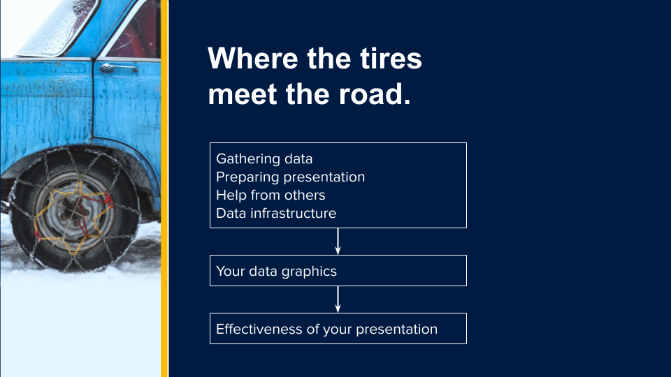
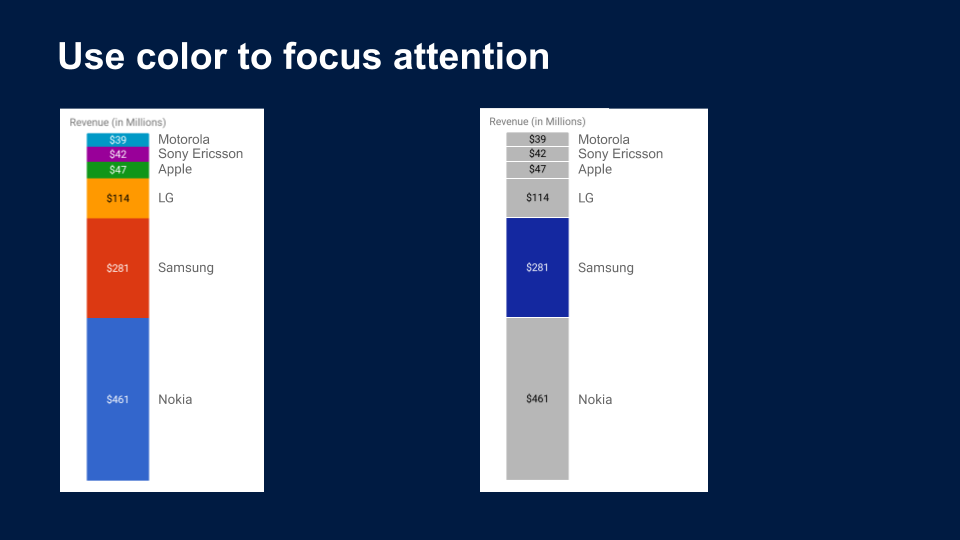
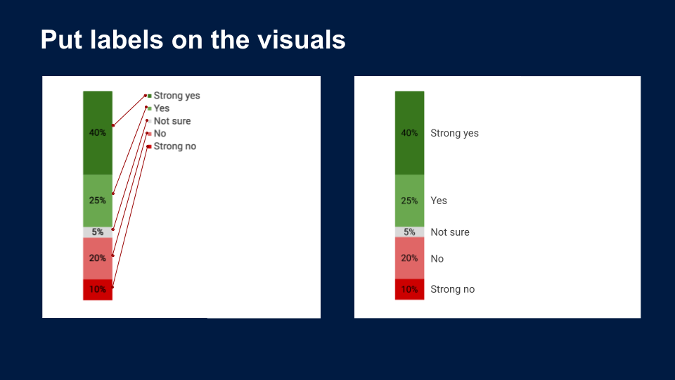
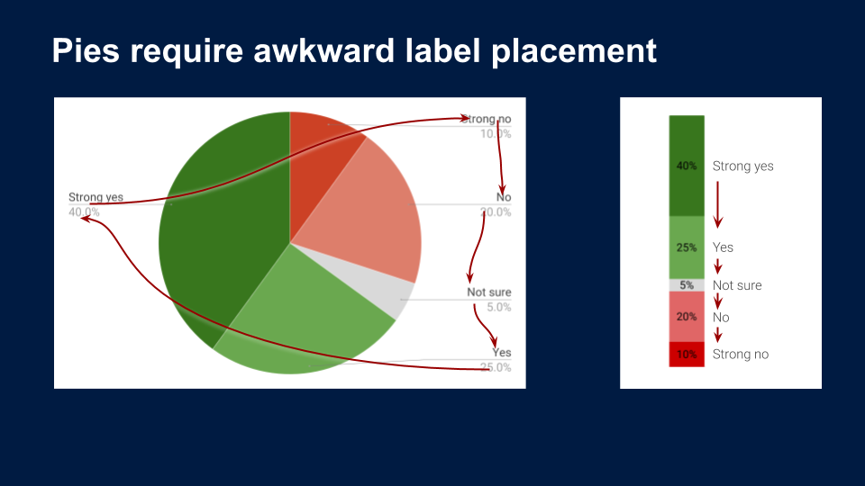
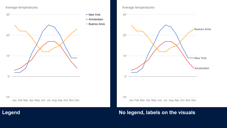
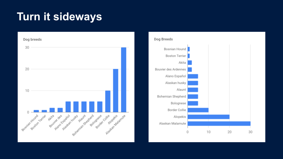
During my time at Booking.com, I saw a lot of data and I saw a lot of data visualizations in the form of bar charts, line charts, and pie charts. I noticed that teams would spend a lot of time and effort gathering and organizing the data, but when it came to sharing that data with others, there was not so much effort put in. Information graphics is a particular passion of mine, so I took it upon myself to make a presentation highlighting the importance of data visualizations. My primary goal was to get people to think about the best way to present their data graphics instead of relying on the default chart or visual that came out of Tableux or Excel. The following is a few screenshots of the presentation. If you would like to see it in action, please check out this video of me presenting it.