A smartphone poker app for faster, simpler play, designed for players who want to improve their poker skills.
First let’s say this: I love poker. Anyone who has known me for more than 2 days has probably been invited to a poker game at my house. I’m a casual player, but still I like to improve my skills whenever possible. To that end, I wanted an app that I could use to practice anytime, I had searched in the past but never really found what I was looking for. I wondered if I should build my own.
Competitive Research
Before setting out to build my own app, I did an evaluation of existing poker apps in the App Store. All the existing poker apps had all or some of the following problems:
- No offline playing
- You play against real people using fake money.
This means you have to wait for each player to decide their move and they often play erratically, making overly large bets or leaving mid-game. - Overly elaborate skeuomorphic designs.
Typically the design tries to emulate the look of a real poker table, with avatars sitting around it, often with drink icons or other unnecessary clutter. - No emphasis on improving your skills.
Few of the apps would help me develop as a player.
A large portion of the poker apps have nearly identical designs and nearly identical gameplay: the poker table graphic and avatars occupy a large portion of screen real estate, forcing essential UI elements (buttons for Bet, Call, Fold, etc.) to be very small and hard to tap accurately with a finger tip.
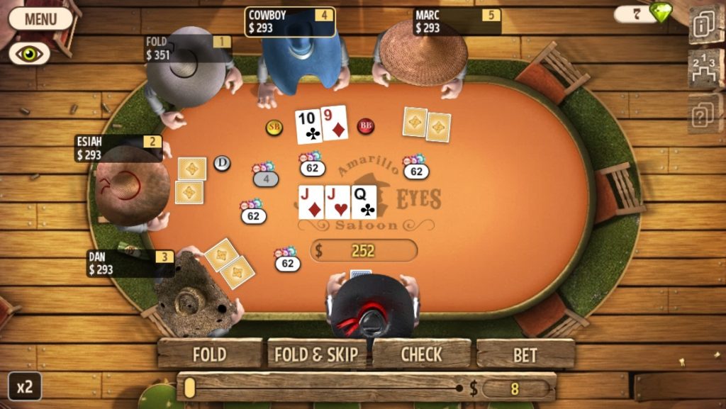
One of the many similar existing poker apps 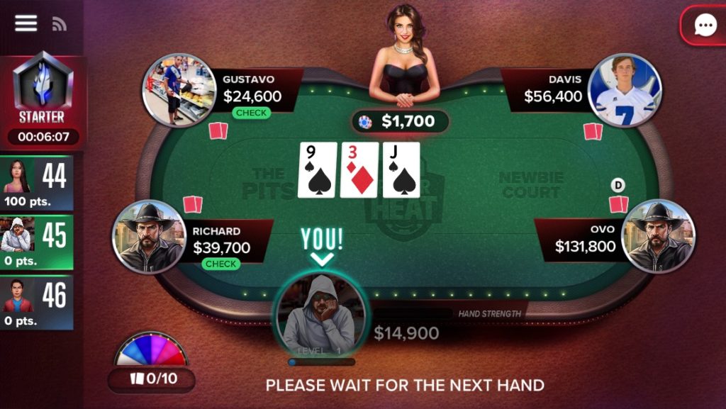
One of the many similar existing poker apps 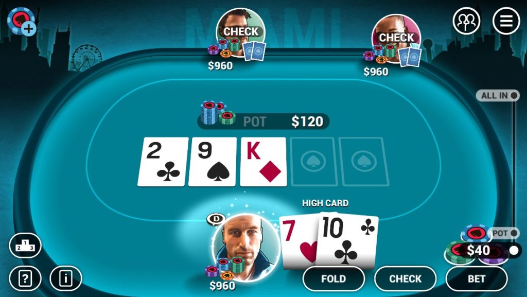
One of the many similar existing poker apps 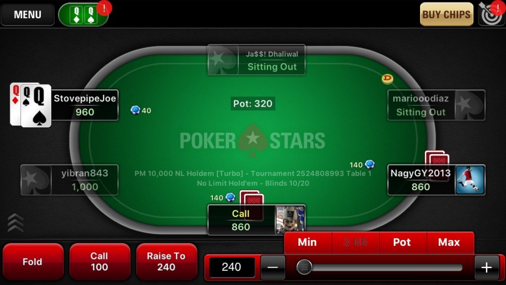
One of the many similar existing poker apps 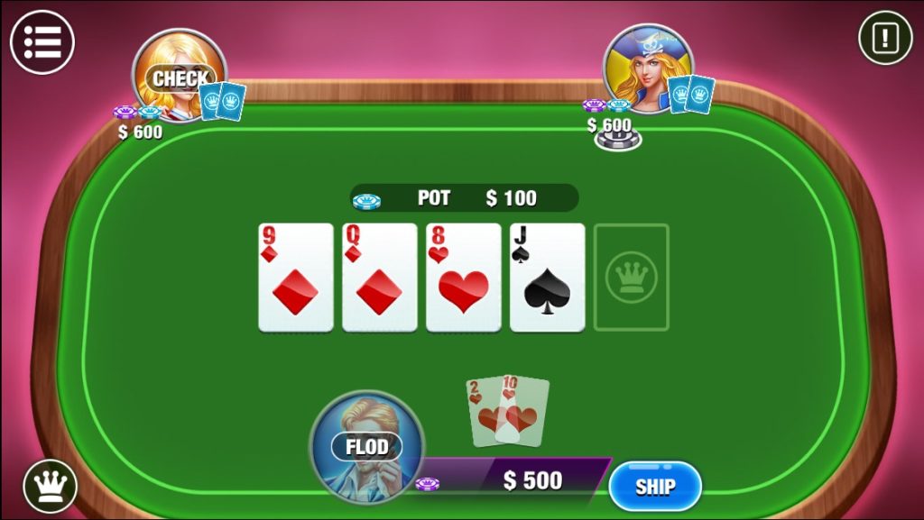
One of the many similar existing poker apps 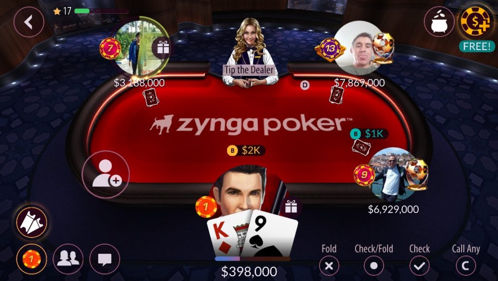
One of the many similar existing poker apps
User Research
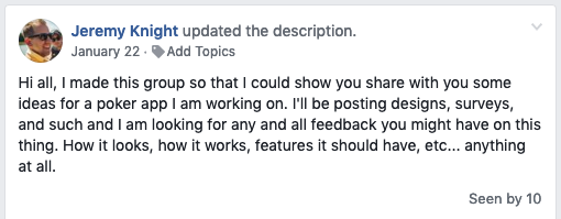
After the competitive research, the first step was determining if the issues I was experiencing were shared by others, as this would tell me if there was a potential audience for the app. Luckily, I have acquired quite a few poker friends over the years who would make a perfect test group, so I reached out to them via email and a Facebook group.
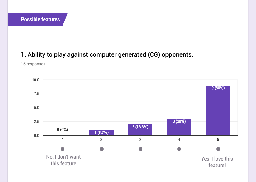
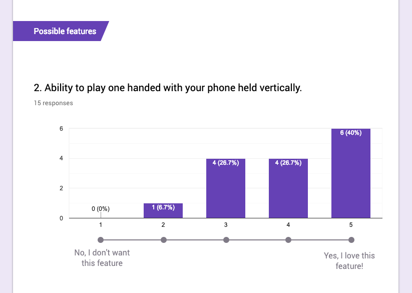
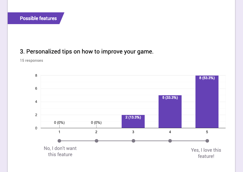
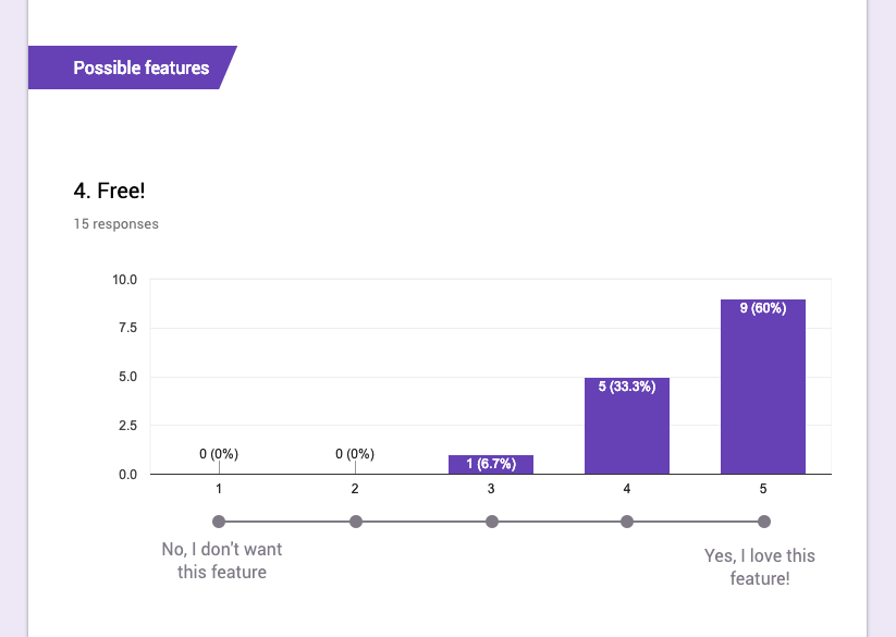
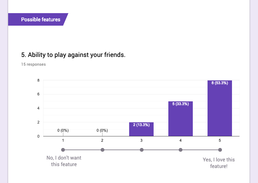
I started with a basic survey asking my audience about their poker skill level, their use of smartphone games, and then listing out the potential key features and asking them to rate their interest in each.
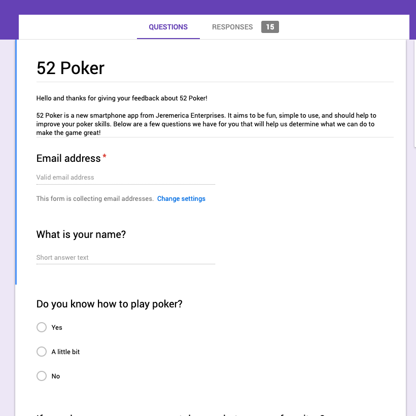
User Research Survey, Part 1 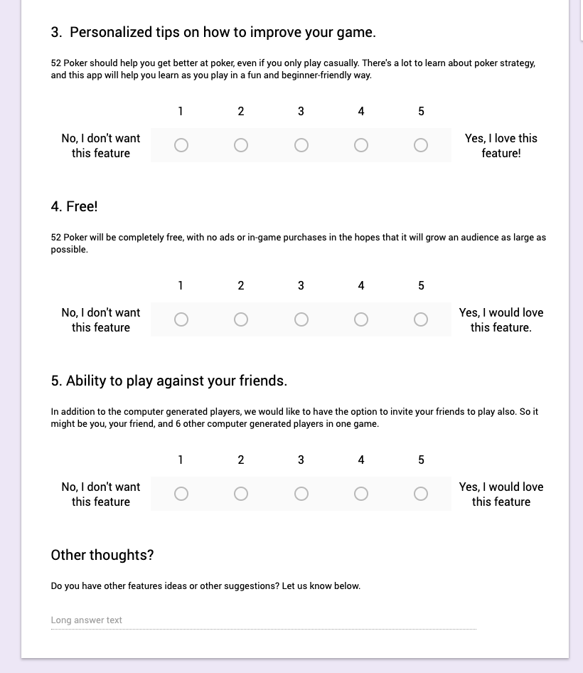
User Research Survey, Part 2 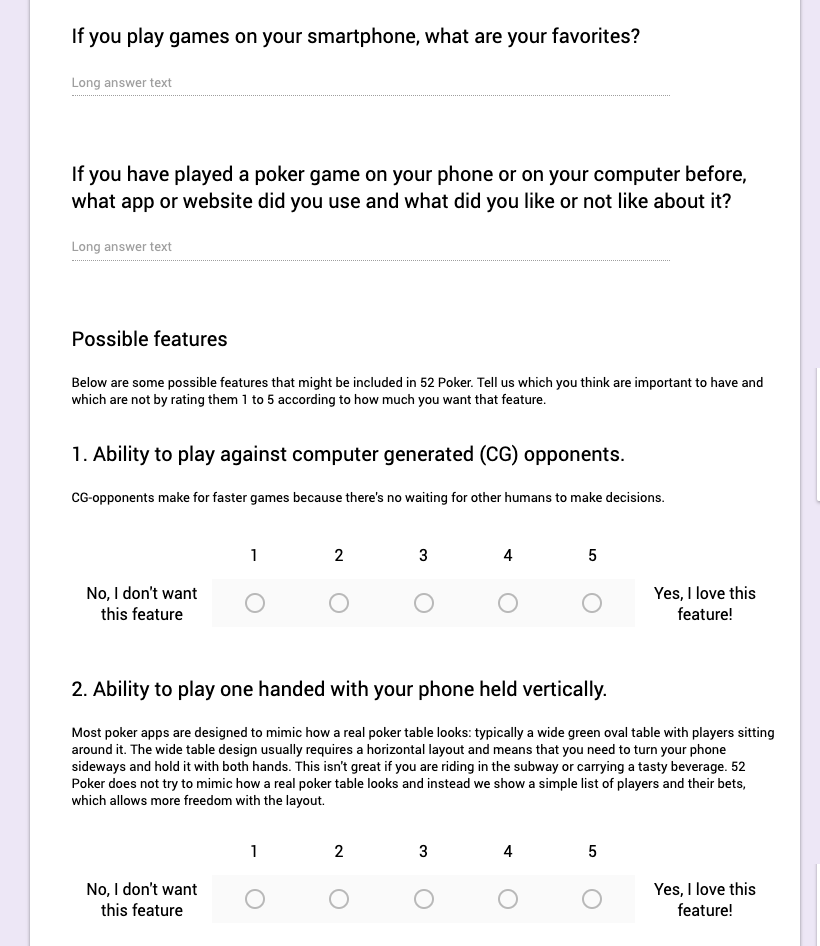
User Research Survey, Part 3
The responses were very encouraging! All the feature ideas had almost universally positive response. This was a strong indication that I had hit on a potential opportunity.
Wireframes
After validating that the idea had potential and that the features were resonating with the test audience, it was time to begin the design process by making some wireframes. At this point I wanted to see what content and UI we would need in the app and how it could fit together on the screen. I determined that we would need 4 screens or states for the app:
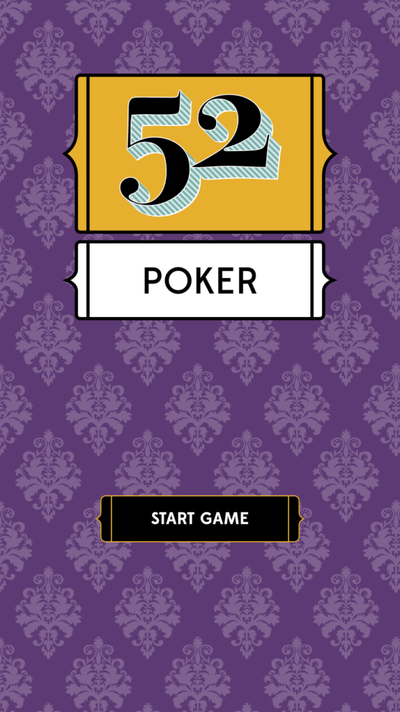
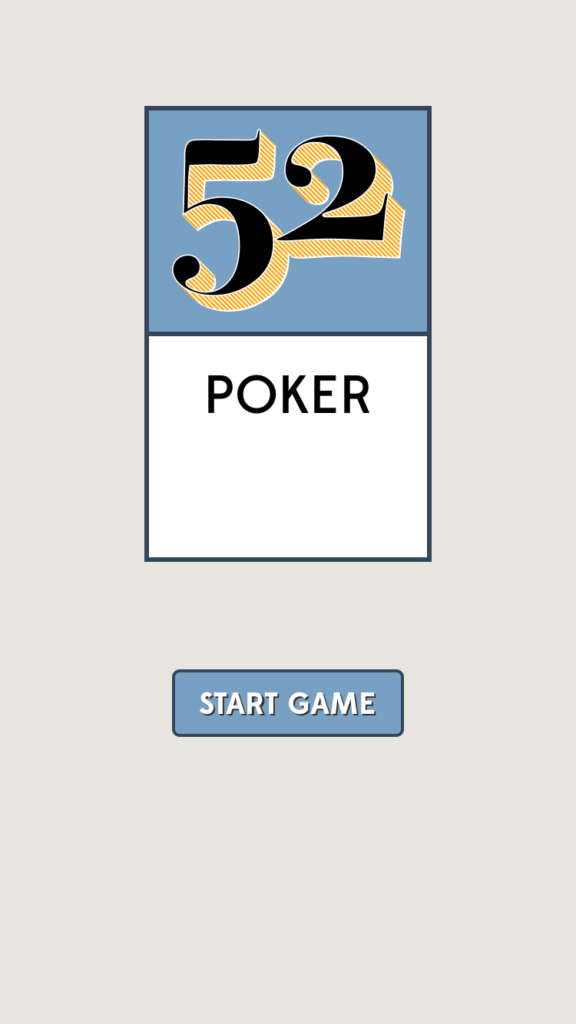
- Intro screen
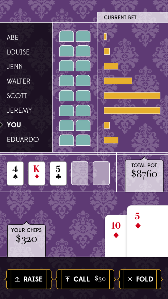
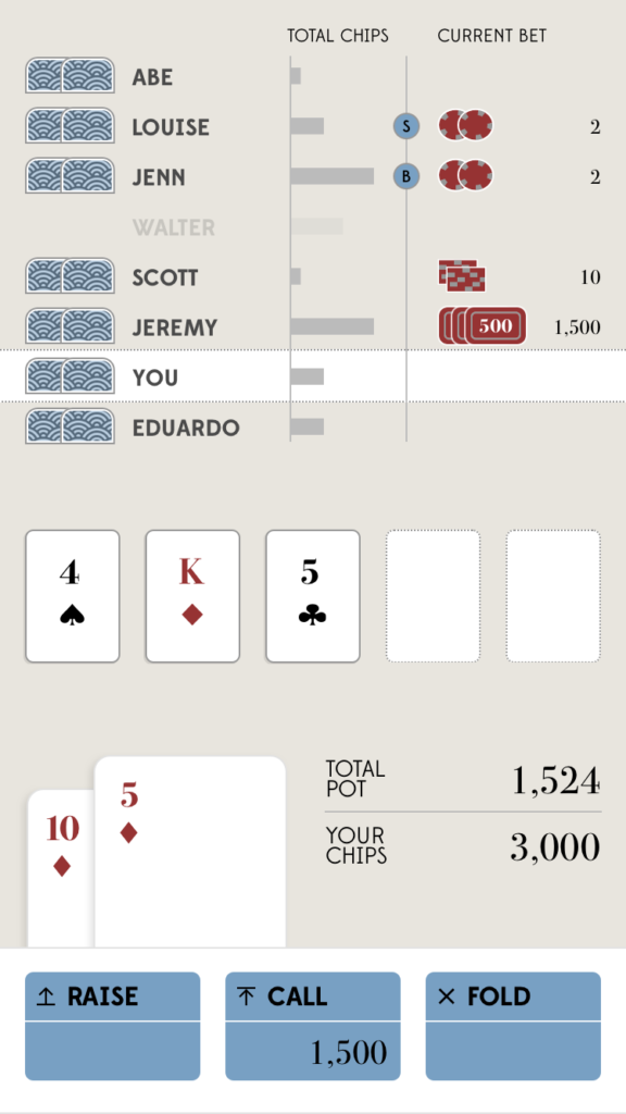
A logo and a “start game” button - Mid-game screen
All the players, bets, shared cards, pocket cards, chip totals, and user action buttons. - Showdown screen
Similar to the mid-game screen, but with - Jackpot distribution screen
The showdown screen, but showing the jackpot distributed to the winner(s)
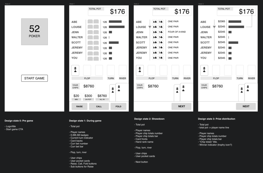
Initial wireframes for the 4 states of the app showing basic functionality and a rough layout.
By replacing the poker table graphic with a simple list of players, it gives me a lot more freedom to do different things with the layout including making large finger-sized buttons. I designed for the smallest mobile screen size first to make sure I had a design where everything could fit, then I can scale up the design for larger screens.
Design Concepts
For the visual style of this app, I wanted to get away from the busy, cluttered, skeuomorphic designs of the existing apps and try out something different. I wanted something clean and simple but with a little bit of sophistication. I tend to be fairly restrained and minimalist as a designer and I wanted to take this opportunity to push myself outside my comfort zone. I decided to do one concept in my comfort zone and one concept that pushed me outside of it, using colors and styles I normally would avoid.
Round 1
Below you can see the both concepts, one minimal and one ornate, each with with the title screen and mid-game screen mocked up.

At this point I tapped my poker friends focus group again and ask them to provide feedback on these two directions. I received some great feedback on both concepts.
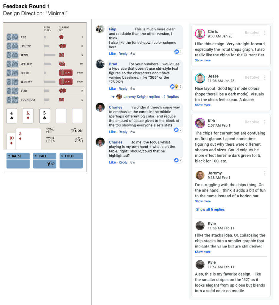
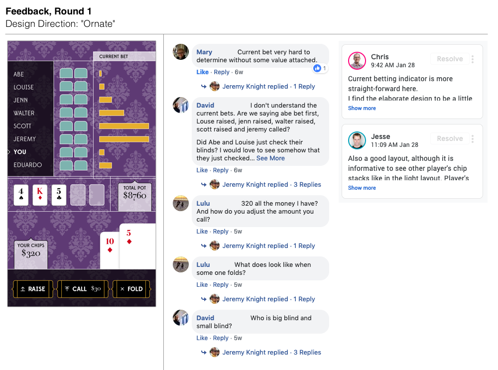
From all the feedback I received I was able to boil it down to a few key takeaways:
- People preferred the “minimal” direction.
- The old-style numbers were confusing
- More clarity was needed on basic game mechanics (who’s turn it is, big blind, small blind, chipstacks, etc).
- More emphasis was needed on the cards, less on the player list.
- The chip visuals were confusing.
After distilling the feedback, it was time to implement the those changes into the design and create round 2. At this point I shelved the “ornate” design direction to focus on the approach that was most favored by my audience.
Round 2
With Round 2, I incorporated the feedback from the previous round with a few exceptions (I was still struggling with the ideal way to visualize each person’s current bet) and put it back in front of my focus group. This time I got less feedback which I hope was indicating that things were improving.
Although I got less feedback, I noticed some issues on my own and I had some new ideas for features. I combined all of these together to create Round 3…
Round 3

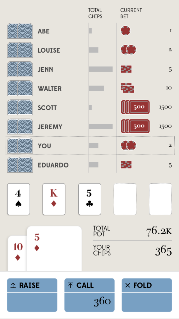
For Round 3, I implemented the following changes based on my own observations and user feedback:
- Title screen: Made the orange stripes wider.
- Moved the “Total Pot” indicator closer to the shared cards
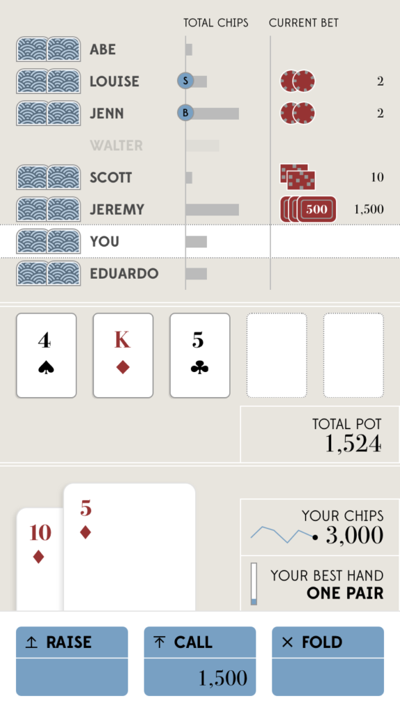
- New feature: Added “Your best hand” section with hand strength indicator bar chart.
- New feature: Added sparkline (mini-graph) to the “Your chips” section.
- Put the above 3 things in little boxes and added some divider lines to the layout to give things more structure.
- Moved big blind and small blind indicators.
- Fixed alignment of “Total chips” and “Current bet” labels.
I was feeling really good about the design at this point, so I decided to move on to development. Both my audience and I were really excited to try it out.
As I began to code the design elements in to the app, I started to notice some more areas for improvement in the design. Some issues that were brought up in feedback rounds were not fully resolved, some new ideas came to light, and new problems were encountered. Ideally, all design is finalized before coding begins, but in my experience there are usually some unforeseen issues that crop up in the development process. My goal as a designer is to minimize these issues as much as possible, but if they do crop up, it’s also my job to find practical solutions. With that, it’s on to Round 4.
Round 4
In this round, I resolved a few issues that were either unresolved from earlier rounds of feedback or new issues I noticed in development:
- Redesigned the chips in the “Current Bet” to be simpler and more intuitive.
- Adjusted the layout for different mobile phone sizes.
- Removed the pocket cards from the player list to allow more room for other elements.
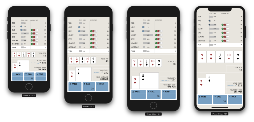
Adjusted designs for different phone sizes.
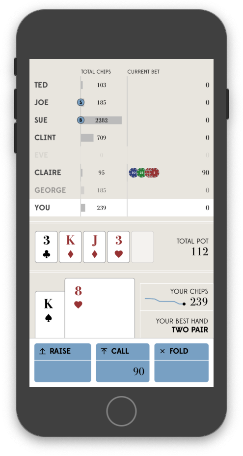
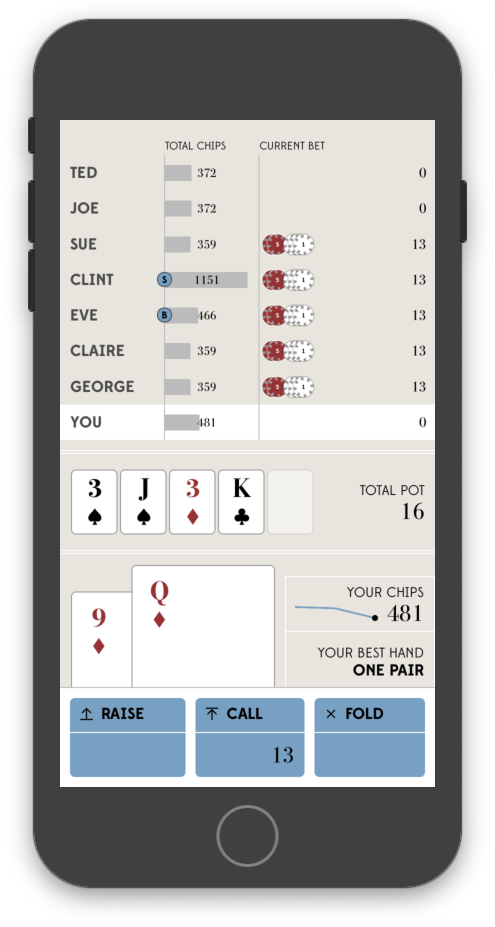
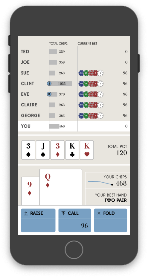
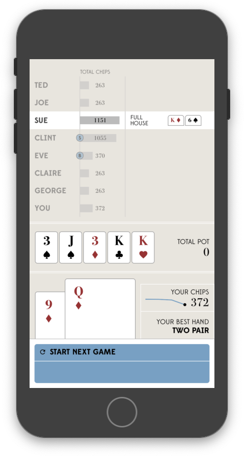
The project is definitely not complete, but I think this stage of the design represents a Minimum Viable Product that I can use to gauge the interest of an app like this among a wider audience. Below are a few more screenshots of the design at various stages of the game.
What’s Next
The project is now in the development phase. I plan to share a playable version with my focus group when it is ready, gather feedback and bugs and then move on to publishing it to the Apple App Store and Google Play as a free app. If you interested in playing the final product or testing an early release, please let me know.