One of the most frequent graphs employed at 15Five (and in the world at large) is a line chart showing changes in data over time with labels along the bottom indicating dates. The date axis is something that very few data visualization tools get right, in my opinion. It needs to be flexible enough for a wide variety of time scales because a chart could span a few days, several months, or many years. Most data visualization tools struggle to display this in a way that reduces clutter and repetition while also being intuitive to the user.
About 15Five
15Five is a B2B SaaS employee performance management tool with a suite of features to help companies increase employee engagement and productivity through 1-on-1 meetings, OKRs, weekly check-ins, 360° feedback, and employee recognition. It exists in the same space as Lattice, CultureAmp, and Workday.
Common pitfalls of time-based charts:
- Unnecessary repetition of labels:
In a time series of “Jan 2020, Feb 2020, Mar 2020, Apr 2020” there is no need to repeat “2020” for each label, it adds clutter to the chart and inhibits comprehension of the data. - No delineation of major calendar milestones:
If a time-axis spans more than one year, it should mark the new year in some obvious way, such as with a vertical line. - Not abbreviating months or days of the week:
There is no reason to spell out “February” when “Feb” is just as comprehensible and more compact. Not only is it shorter, but it is also more consistent in width. The same goes for days of the week: “Tuesday” vs “Tue.” - Crowded labels:
When pitfall #1 and #3 (repetition and lack of abbreviation) are present, it usually results in crowded labels and/or labels being omitted to save space, such as skipping from “January 2020” to “April 2020.” Another manifestation of this issue is the use of slanted or vertical labels which are more difficult to read.
Below are a few examples from popular data visualization tools (Google, Asana, Zoho, etc) that all commit at least one of several common pitfalls when creating this type of time axis.
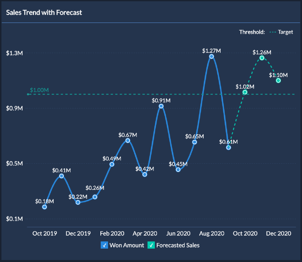
Repeating the year (“2020”) for each label adds clutter to this chart. 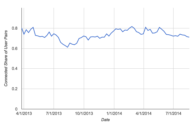
Months should be shown as words, not numbers, to avoid confusion in cultures where dates are written DD/MM/YY instead of MM/DD/YY 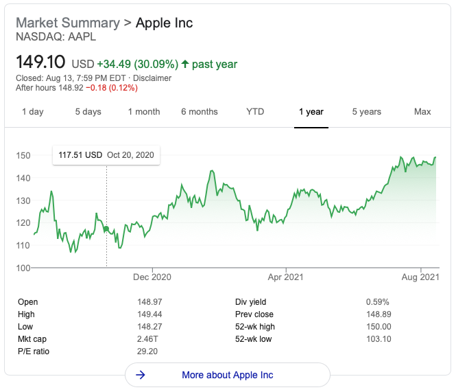
This chart spans 2020 and 2021 but it is not clear (without hovering) where the new year ticks over. 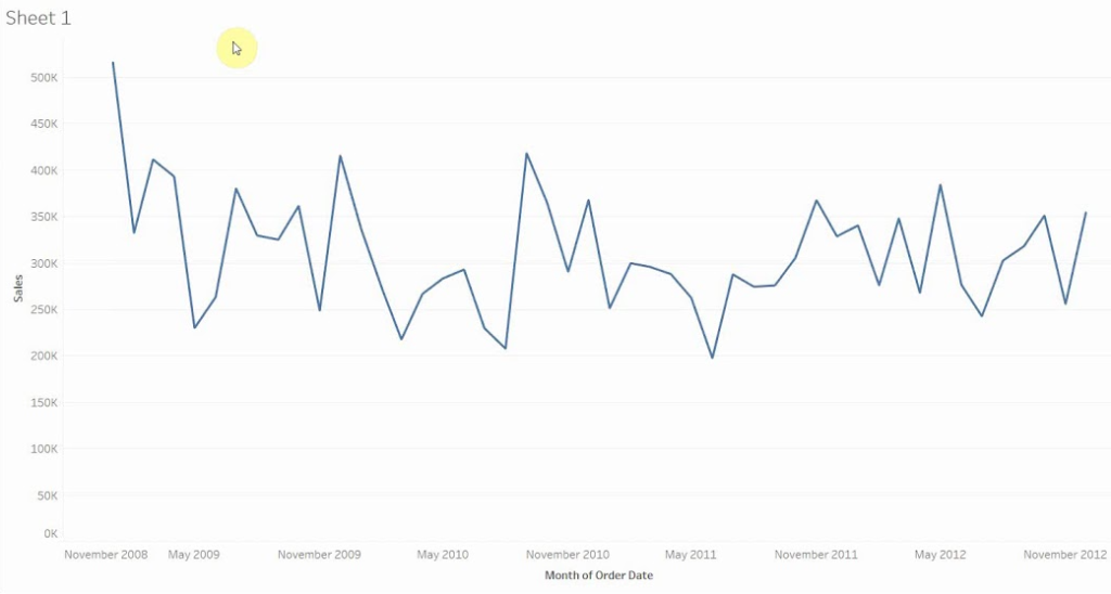
Shortening the month name to 3 letters would help labels to be smaller and more consistently sized. 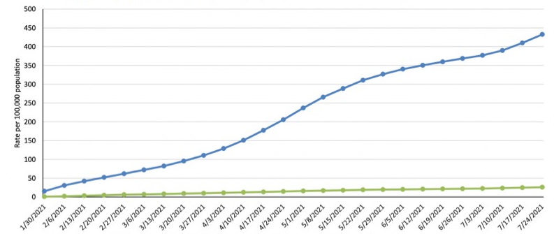
Slanted labels are hard to read and would be unnecessary if the year numbers were not repeated for each label. 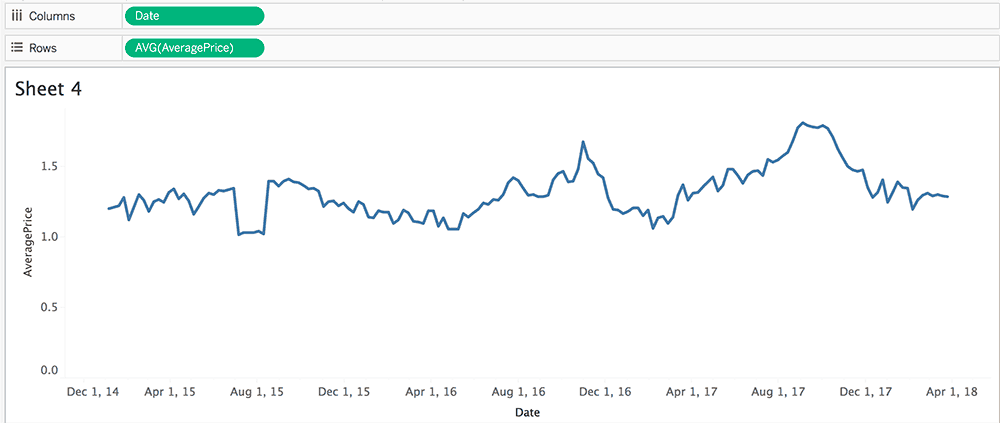
The day of the month can be removed entirely here.
Like other data visualization tools mentioned above, 15Five’s time-based charts also suffered from some of these issues, but I knew we could do better.
The idea
Designing a better date axis is not so difficult if you are designing it for a specific set of data that doesn’t change. For instance, a chart in a printed annual report showing quarterly earnings over time. It is quite a bit more challenging to design a date axis for interactive dashboards that show a wide variety of date ranges in a wide variety of dimensions (some narrow, some wide).
My idea for a solution was fairly simple: create a time axis label component that consists of several rows. The first row is the most granular (i.e. days or dates), the second row is slightly less granular (i.e. months) and the third row, if necessary, is the least granular (i.e. years). This approach separates each time measure (day, month, year) on to its own row, which decreases repetition and increases readability.
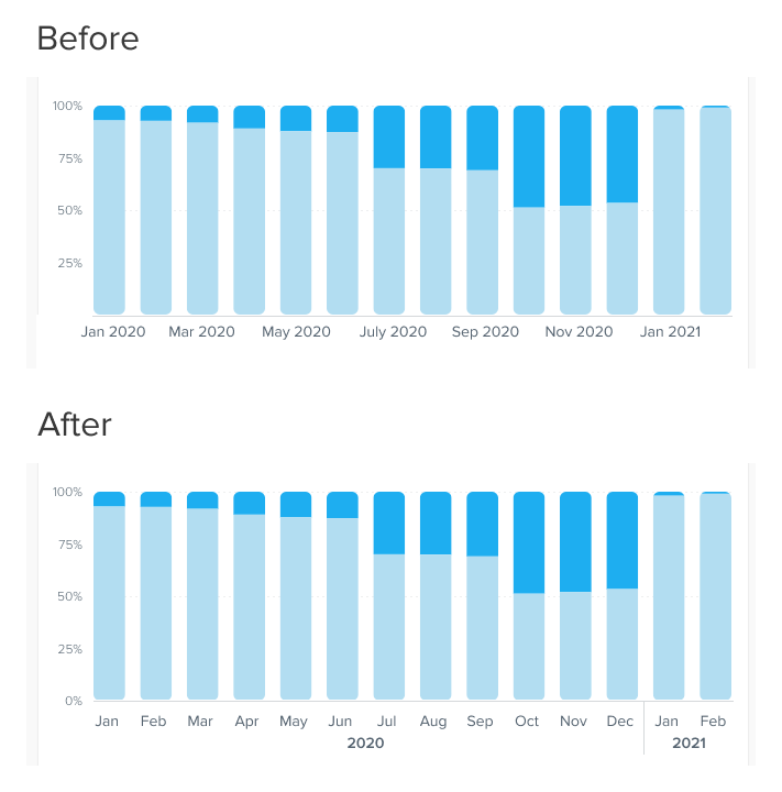
Below is a typical chart showing a typical time axis on top and my redesign on the bottom.
Although this idea is fairly simple to explain, it becomes vastly more complex when thinking about how it will be put into practice for both design and code. For the next steps, I made sure I was accounting for all edge cases by designing many variations of the idea with different data sets and thinking through how the actual code of the component would work.
Designing variations
Because of the many different possibilities of date ranges, it was essential that I design as many variations as possible in order to identify any edge cases where the design might break. Below is an image of part of this process.
Mapping the logic
Designing the axes was only half the battle, so I took it a step further and designed a flow chart of the logic that the developers would need to code in order to display the right type of label in the right situation.
The previous step of designing many variations helped me to realize that the type of labels shown needs to be a product of primarily two things:
- The width of the chart:
Wider chart areas can hold wider and more detailed labels. - The time span:
Does the chart span years or days? A chart showing 10 years shouldn’t try to label individual days.
Using these two variables I was able to design a simple flow chart that helped developers to code the logic that determines which type of labels to show.
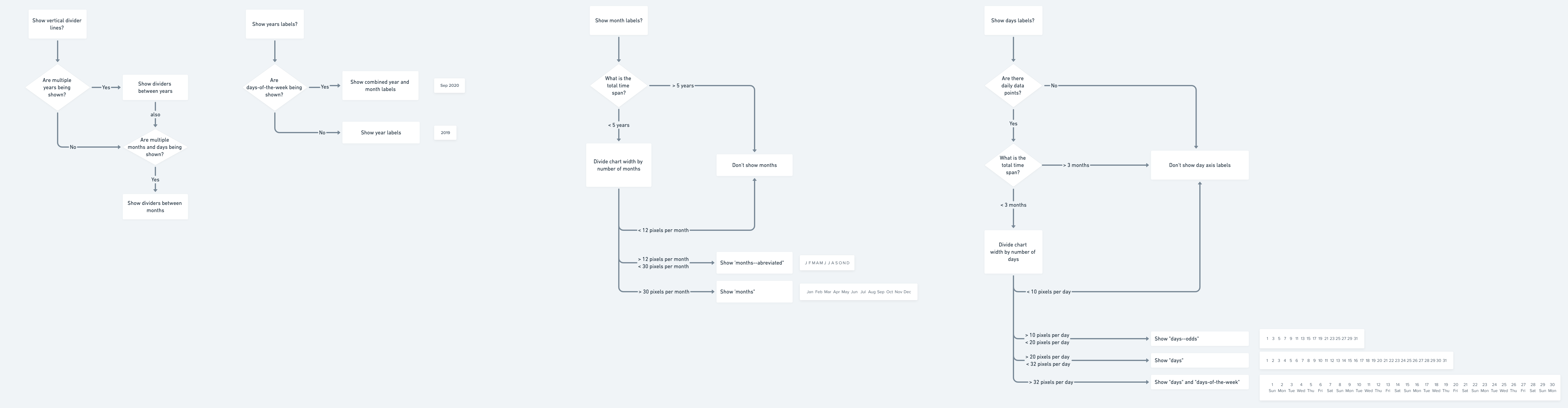
This flow chart really helped jump start the coding process and helped to answer developer questions if I was unavailable. The developers were able to take this flow chart and my designs and construct the time axis component with very little involvement from me.
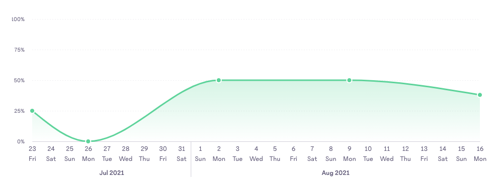
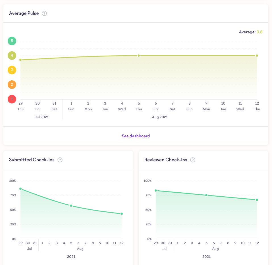
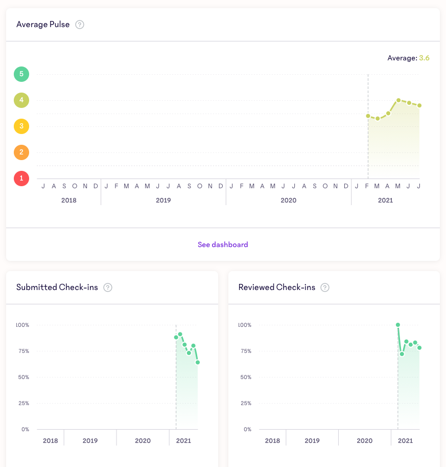
The result
After the time axis component was coded, I was quite pleased with the results. It was flexible, easy to understand, and reduced chart clutter significantly.
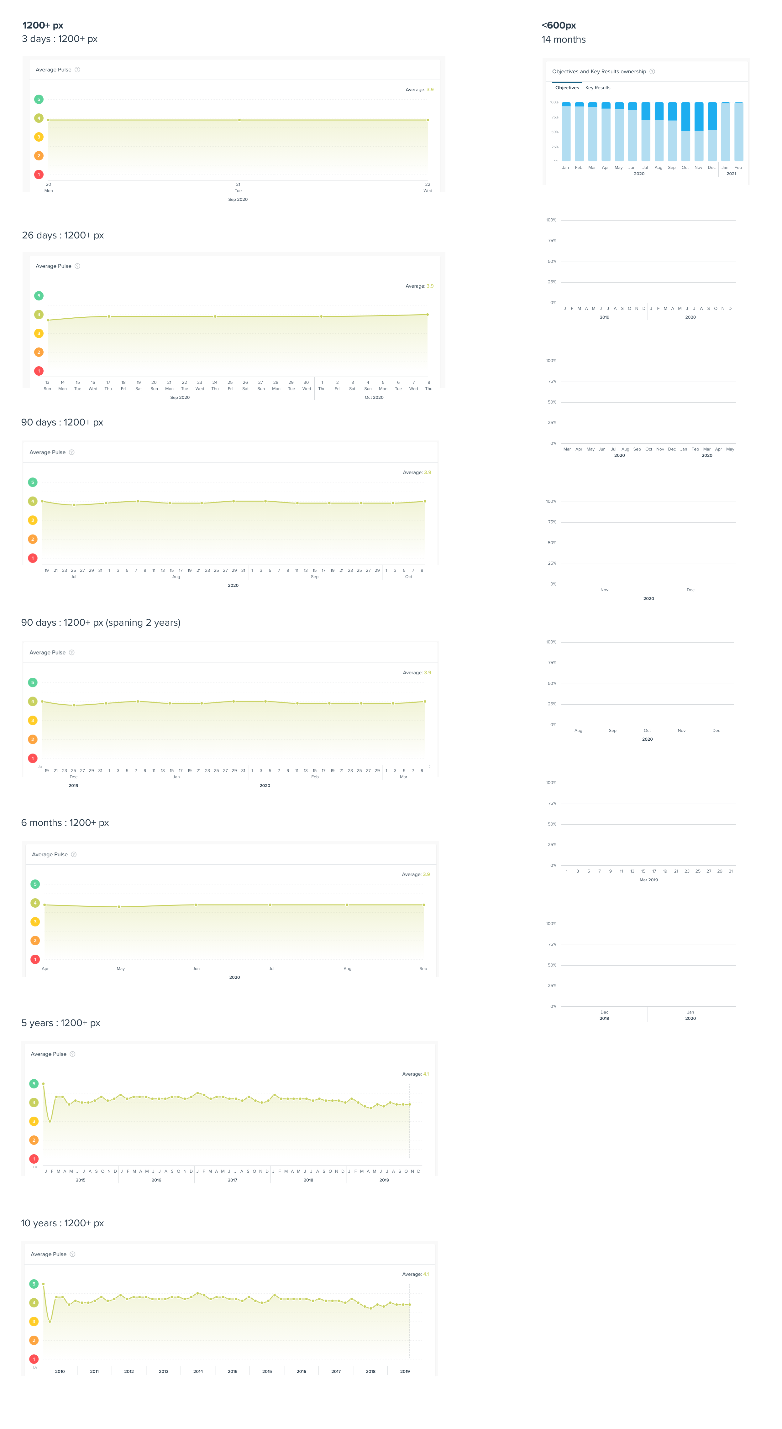
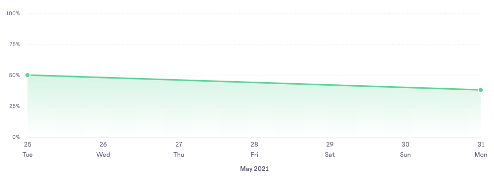
Here are a few examples of the flexible date axis component showing widely different time ranges and chart widths.
What’s next
Although I’m pleased with the result of this project, what’s missing is testing the changes with real users to confirm that it is easier to read and digest the information presented. At some point in the future I would like to run some user tests on these new designs to validate my ideas.
Additionally, I would like to share this with other companies that do a lot of data visualization so that we can improve these types of charts beyond the lucky users of 15Five.