Background
During my time at Booking.com, I worked for several years on the reviews team and I was the designer in charge of the reviews collection flow. After a user completed a trip, we asked them for reviews of hotels, cities, and points of interest they visited. This information was then used to inform other travelers and help them to have the best possible trip.
The experiment below focused on the city review form where a user would review the city they visited and provide other helpful information to their fellow travelers.
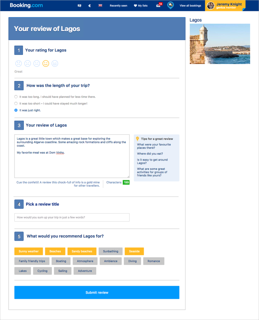
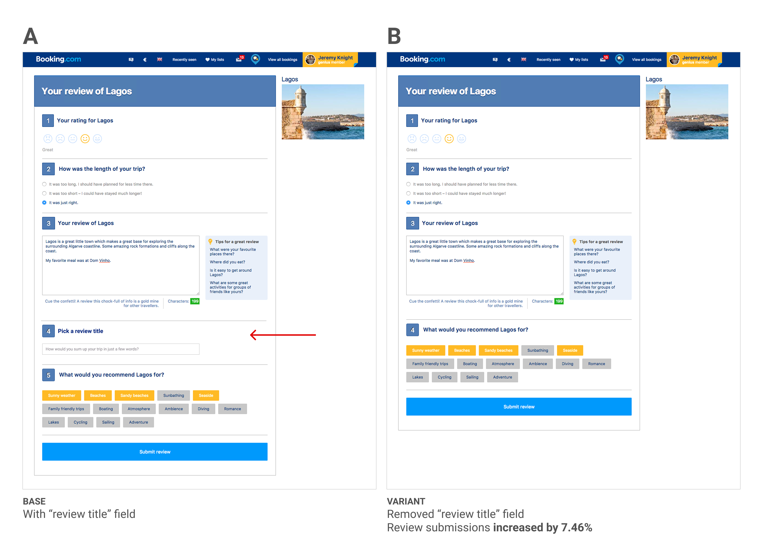
Our city review form looked like this:
Hypothesis
Based on previous experiments on similar forms and in-person user tests, we knew that the “title” field can be a surprisingly difficult obstacle for users who are completing review forms. Even though the full review field is larger, it’s easier for users to fill out because they can write freely about their experience without constraints. By contrast, the title field requires the user to summarize their experience in just a few words which can actually be more challenging. It reminds me of the famous quote: “If I had more time, I would have written a shorter letter.”
Because the review title was not a crucial element in city reviews, we decided to remove it as an A/B test to see if we could increase the submission rate of the form.
Results
We ran the experiment for one full week, with a total of 900k visitors in both variants. Our primary goal destination review submitted increased 7.51% (± 0.30%) in the “B” version of the test. In short, it was a definitive win.
Learnings
Although the obvious learning here is that removing fields, especially difficult ones, can improve form conversions, it’s also worth noting that sometimes it’s not obvious which are the “difficult” fields. At first glance, we might have assumed that the title field would be a relatively easy field, because it is so short. But through user testing and experimentation we discovered the opposite.