Background
During my time at Booking.com, I worked for several years on the reviews team and I was the designer in charge of the reviews collection flow. After a user completed a trip, we asked them for reviews of hotels, cities, and points of interest they visited. This information was then used to inform other travelers and help them to have the best possible trip.
The typical user flow for review collection went like this:
- Email invitation sent to user to write a hotel review
- Hotel review page
- City review page
- Thank you page
- Multiple reviews page
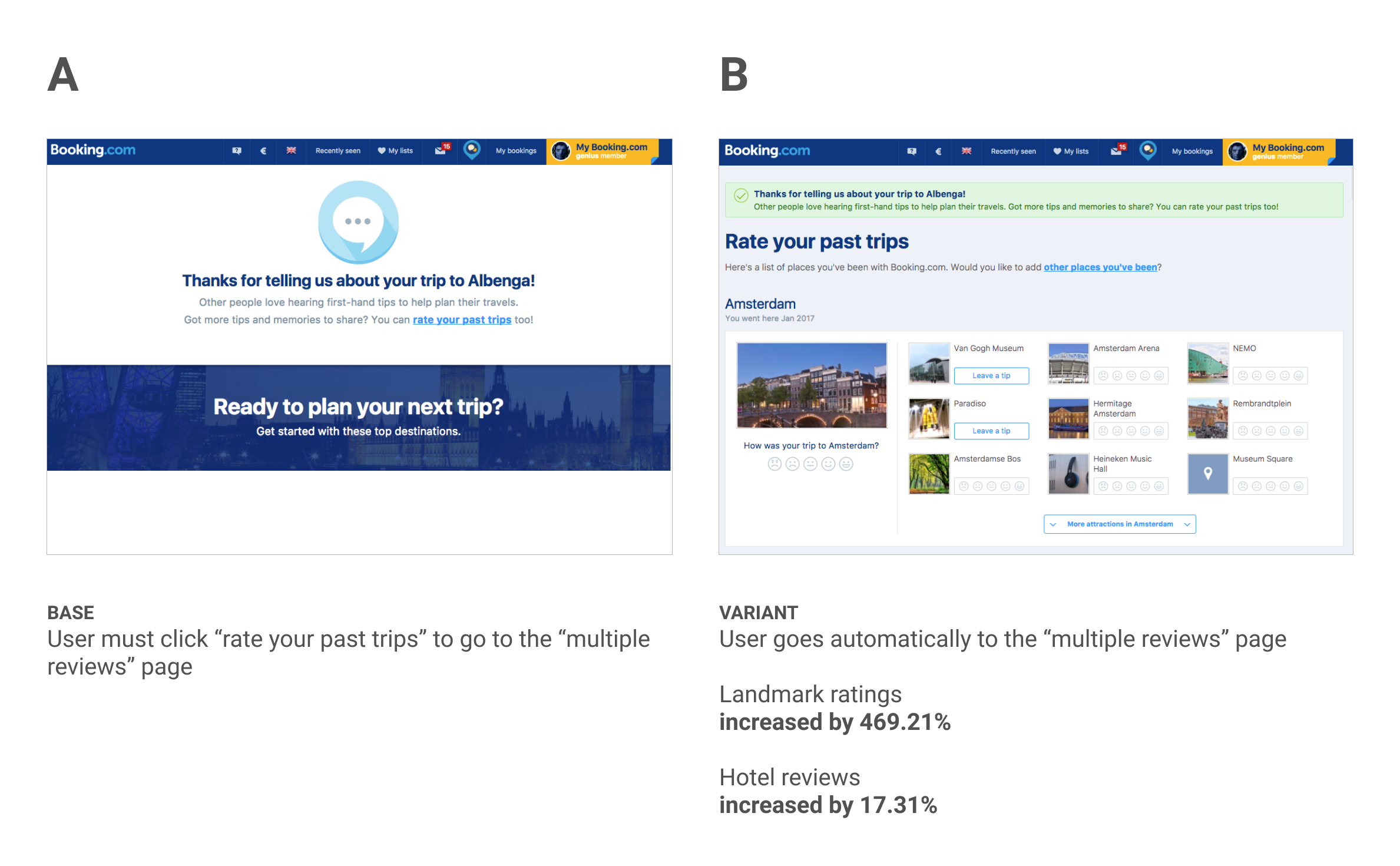
Steps 4 and 5 are the focus of this experiment. The “thank you” page simply thanks the user for their reviews submitted so far and gives them the option to click through to the “multiple reviews” page.
The “multiple reviews” page lets users review and rate hotels, cities, and landmarks from all of their past trips, not just the most recent one. This page was created by our team as a sort of catchall at the end of the review flow. It was a way to capture as much review information as the user would like to give.
Hypothesis
The “multiple reviews” page had been very successful in collecting reviews and ratings but we saw an area for improvement in how users landed on the page. As mentioned above, the user is first taken to a “thank you” page and given the option to click through to the “multiple reviews” page. We surmised that if we removed the “thank you” page from the flow and placed users directly on to the “multiple reviews” page we could reduce dropoff and increase reviews as a result. As part of this experiment, we designed a new version of the “multiple reviews” page with a simple “thank you” banner at the top to make sure we still communicated our appreciation to the user.
Results
We ran the experiment for one week, with a total of 678k visitors in both variants. Because of the nature of this page we had many goals to track for both ratings and reviews of hotels, cities, and landmarks. Here are a few of the key metrics we moved:
- Increased ratings of landmarks by 469.21% (± 19.81%)
- Hotel ratings increased by 17.31% (± 1.58%)
- Hotel reviews with text increased by 16.36% (± 1.86%)
Learnings
This is the kind of experiment you dream of. Over 400% improvement in the primary metric is outstanding no matter what you are testing. To add to that, the level of effort here was very little. A simple “thank you” banner added to the top of the page allowed for us to completely remove one step from the review flow and place people directly where we wanted them to be. All told this was probably a few hours of design and a few hours of coding to create this experiment. The combination of low-effort and high-impact is what makes this experiment a real winner.
This experiment also reinforces the common sense idea that reducing friction in the user experience will yield better results. The extra click we required of the user in Base was causing us to lose out on tons of valuable user reviews and ratings. All it took was a close examination of our user flow to see this easy and impactful change.