Background
While working at the boutique digital agency East Coast Catalyst, I worked on A/B testing strategy for the marketing site for our client Reward Gateway, an employee engagement platform. The purpose of this site is to allow visitors to learn a bit about Reward Gateway and hopefully request a demo with the sales team.
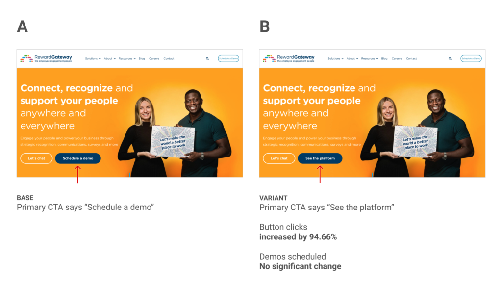
This experiment focuses on the hero area of the home page and the primary CTA button in that area.
Hypothesis
The primary call to action on the hero area homepage of Reward Gateway is a crucial part of the conversion funnel. The homepage sees the most visitors and heatmap analysis indicated that most visitors don’t scroll much past the hero.
The existing copy for this button read “Schedule a demo” and would take people to a page where they can fill out their contact information so that a sales person could reach out to schedule a product demo. Also on this page is a video showcasing the product. Our hypothesis was that the phrase “Schedule a demo” simply felt like a lot of work and that we might get more people further in the funnel by using a phrase that sounded a bit easier. We chose “See the platform” as a good alternative.
Results
This experiment ran for 8 weeks and received 13k visitors in both variants. Our primary goal was an increase in scheduled demos and unfortunately we did not see any meaningful impact on this goal (positive or negative). Interestingly though, we did see a 94.66% increase in visitors clicking this button. Although the central idea of our hypothesis (that “schedule a demo” copy is not enticing) was valid, ultimately the experiment was a failure.
Learnings
Although we proved that “See the platform” resonated better with our visitors than “Schedule a demo,” they still did not convert at a higher rate. My best guess here is that we got them to the form page faster, but it was actually too fast and they had not yet seen enough of the platform to be ready to convert. I think many users were not getting the info they needed in order to feel ready to fill in the demo form.
Although this is a failed experiment, it does provide some learnings which we can use on follow-up experiments. Perhaps we need to provide more screenshots of the platform? Perhaps we need to determine what info is missing and preventing visitors from being ready to get a demo? After more follow-up experiments I think we will learn more about what users are looking for and hopefully be able to provide them with a better experience.