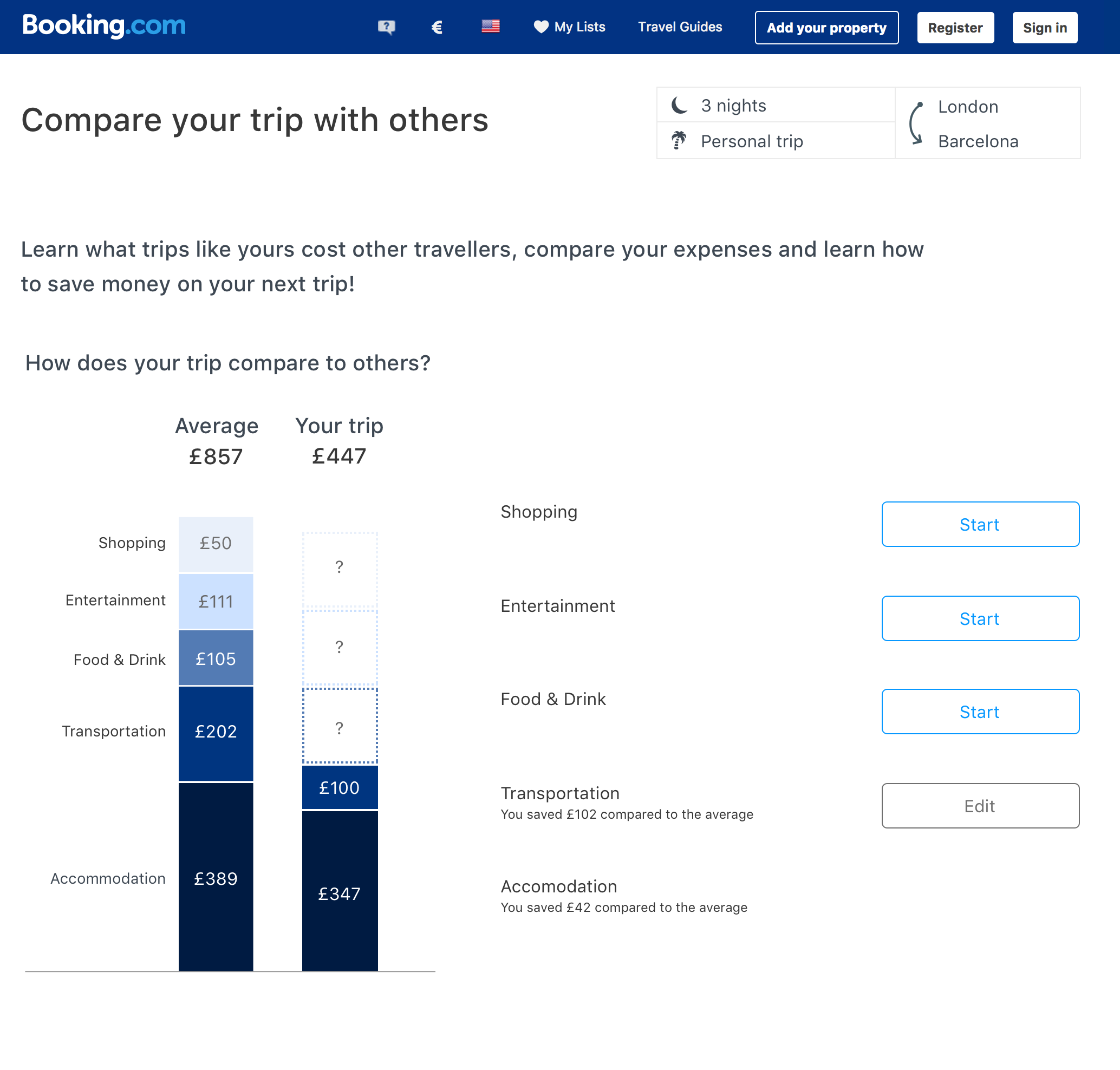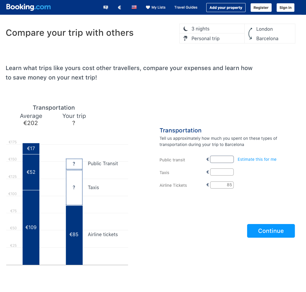
One thing that can be very interesting and useful to travelers is a comparison of how their trip budget compares to others with similar trips. As part of the User Generated Content Collection team, it was my job to figure out a way to collect traveler budget data in a way that made it interesting and fun. We did not want users to feel like they were filling out a tax form, but at the same time, we wanted to keep the interface simple and clean. I designed a series of interactive bar charts that compare your trip costs with other travelers that completed similar trips. The bars change size in real time as you enter your data, making the experience fun and engaging.
