When I was brought on to lead the CaseStack design team, an existing design system was in place, but it had several problems:
- It was overly complex
- It was sporadically used
- Some designers were not aware of how to use the design system
- It was not making full use of recent advancements in Sketch such as Layer Styles and Text Styles
- Some crucial components (such as data tables) were missing
Solving all of these problems was going to require the whole team’s help and therefore, the whole team’s buy in. Luckily this was a receptive group who was eager to learn best practices. To begin, we needed a designer to own the project and coordinate all our efforts. I would have filled this role, but I was happy pass the torch when one of my designers volunteered.
The audit
To determine what needed to be fixed, changed, updated, or removed, we first needed to do a full audit of the existing design system, going through each component one by one and asking questions like:
- “Do we need this component?”
- “Can we make this component simpler?”
- “Can we make this component better?”
I knew from experience that a great way to do this sort of audit was to print out everything we had on our large format printer, gather all the designers around it to discuss, debate, and make notes directly on the paper itself.
Considering the context
The audience for our product design work was almost entirely internal employees of CaseStack and the number of products we worked on was relatively limited. Because of this, it allowed our design system to be fairly simple, and allowed us to remove a lot of unnecessary components and complexity in our audit. This would not necessarily be the case if we were doing the same project in a different context.
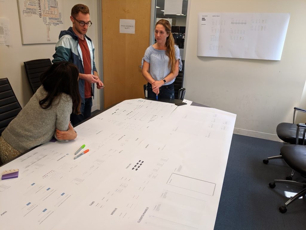
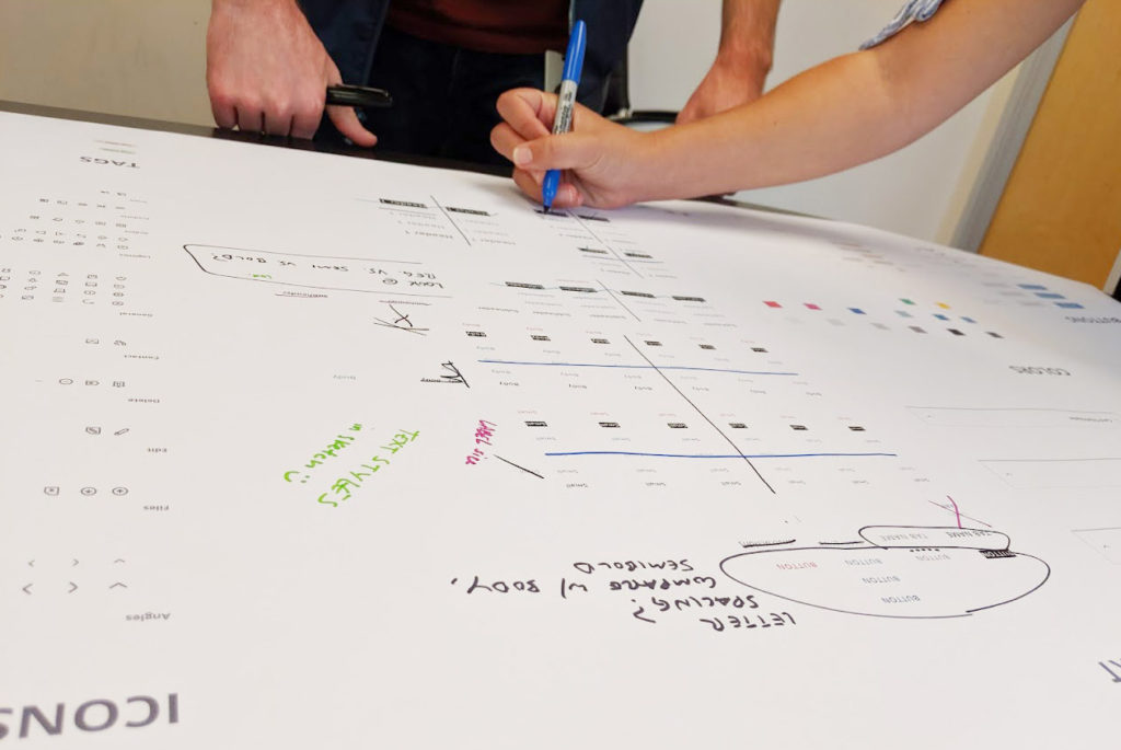
The results of the audit were great. We found lots of things that could be removed, lots of things that could be easily updated to take advantage of new functionality in Sketch that was not available when the original design system was created.
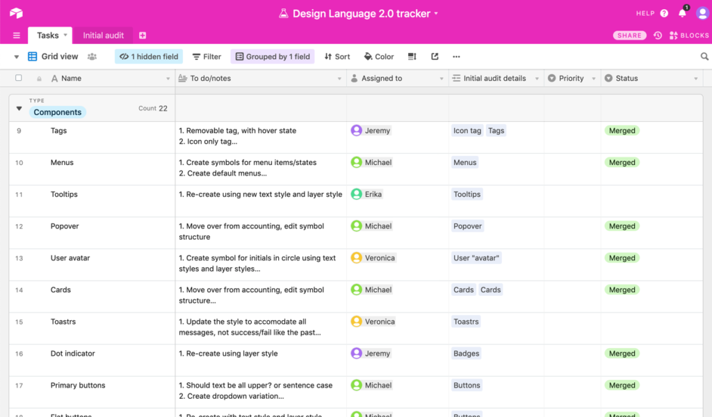
What we were left with was a to-do list of components to delete or update. After converting the handwritten notes to a shared spreadsheet we had a nice, tidy to-do list of components to delete or update.
Sharing the workload
After we had our to-do list, it was simply a matter of divvying up the tasks among our team and tackling them one by one. We used our shared spreadsheet to mark when one of us was picking up a task.
Tracking changes and getting feedback
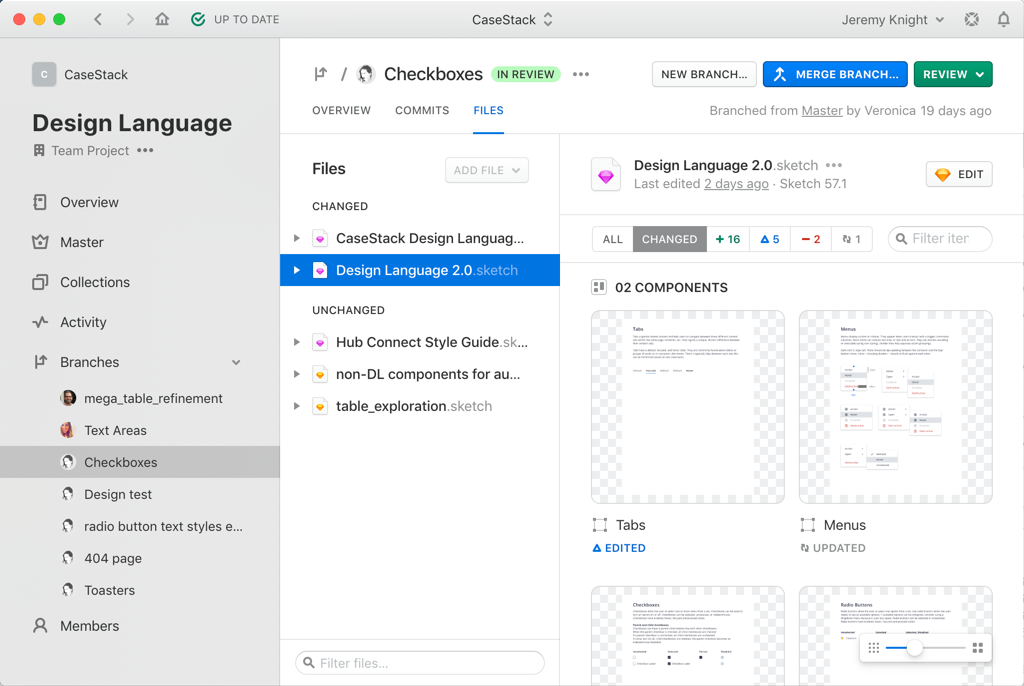
We use a design versioning tool known as Abstract to store our Sketch files and maintain a version history. It works much like GitHub does for coding projects: it allows you to check out a “branch” of a project, make your changes, then merge that branch back into the main project (“master”) for others to see and add to. For each of the design system tasks that we picked up, we would create a new branch. Once the task was complete, we would mark it as “Needs review” in Abstract and post a message in Slack asking for feedback. The entire team has access to the “Needs review” Sketch file and can dig deep into not just the design but also the structure of the component and give feedback on either. Once the feedback has been incorporated, the branch is marked as “approved” and can be merged and archived.
Benefits of inclusion
Early on, we made the choice that this project would be completed by all of the designers, not just completed by one or two and then rolled out to the rest. By involving all of the designers, it accomplished several important goals:
- Faster completion: Having more people signed on to do the work makes the project go faster.
- Better understanding: Everyone involved gains a hands-on understanding of how design systems work. This was especially good for those designers who were not familiar with design systems before.
- More follow-thru: Each designer who works to create the new system will be more likely to use it going forward and encourage its use. No one wants their hard work to be for nothing.
- More context: Each designer brings with them their own experience. One designer may not see value in Component A, while another designer may have used it with great success on previous projects.
Had our design team been larger, involving everyone in such a hands-on way might not have been practical. But some sort of involvement, buy-in, and education is important for all the designers who are expected to make use of the design system.
“If you want to go fast, go alone; but if you want to go far, go together.”
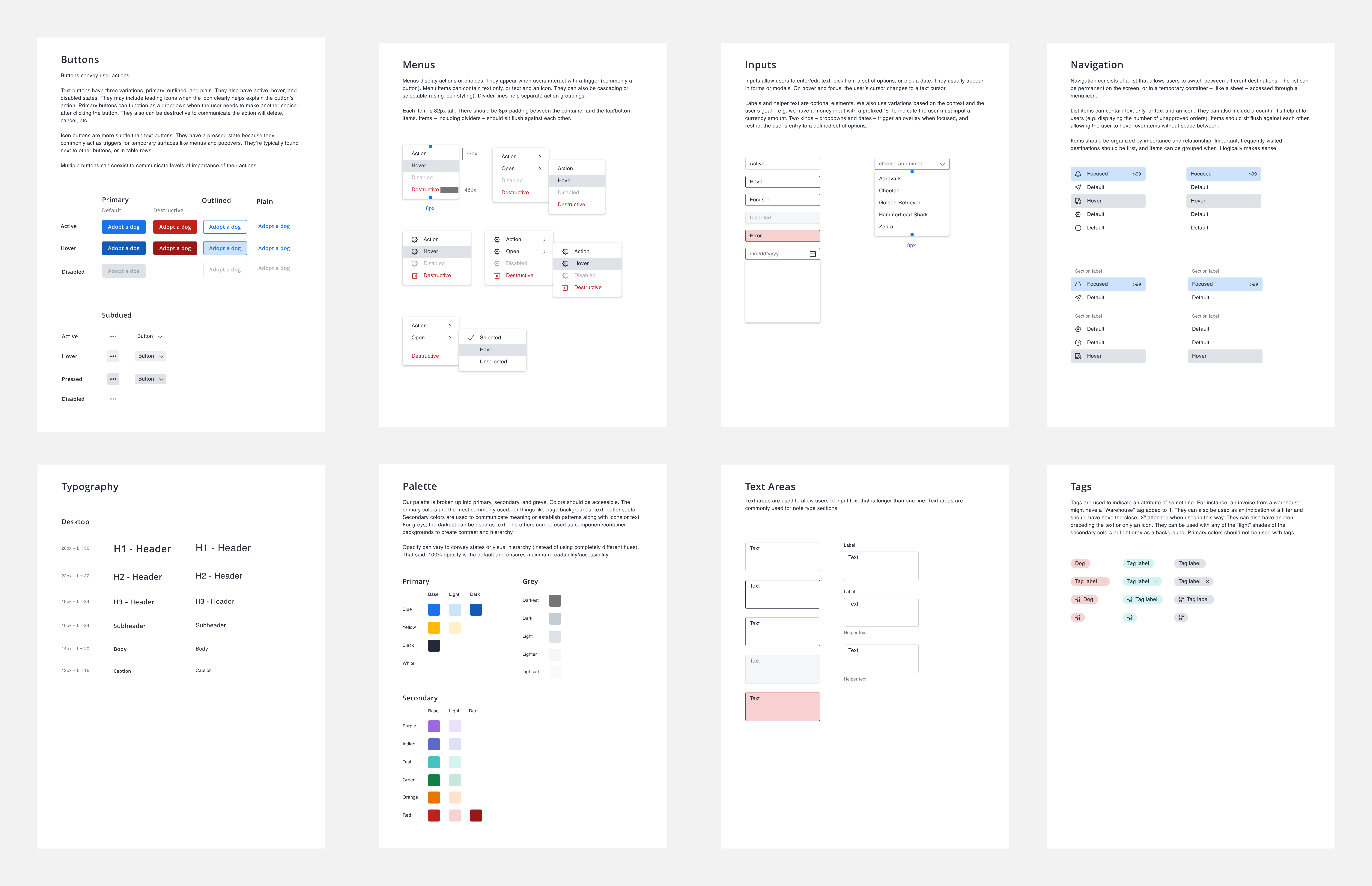
The result
I’m happy to say we were able to create a streamlined, versatile, and intuitive design system in a few short months. Here’s is a small sample of our creation:
What’s next
As of this writing, the design system overhaul is nearly complete, but we won’t stop there. Here’s our plan for moving forward:
- Work with UI developers to build components in code. A design system has many benefits, but one of the most important is the time it can save developers if the designers and developers are working together to make sure that design components sync up with code components. We have kept our UI team in the loop throughout this project.
- Maintain our shared to-do list for ongoing improvements. Design systems must evolve and adapt in order to stay relevant and useful.
- Gather feedback through user testing. As we roll out new products, we will keep a keen eye on any usability issues that might arise from our design system and implement changes as needed.
Learnings
This process has gone extremely well, but we’ve also encountered some obstacles and learned a few things that were not apparent from the start. As we progressed through this project, we hit on a few obstacles and/or tricky decisions. Among them were:
- Component variants: How to structure variations of components (hover, disabled, error, etc). Making some concessions in the design made this issue less complex.
- Structural consistency: How to make sure we were were building components in a consistent and organized way. Establishing a design review process early on helped us immensely.
- Shortcomings of Sketch: Although Sketch has come a long way in supporting this sort of project, it is still lacking. In particular, the lack of a global, dynamic color palette that can live within a Library file caused us to do some workarounds.
Thanks for reading and please reach out if you have questions!