As Senior Product Designer for the Data Insights and Reporting squad at 15Five, I was the design owner of all our reporting dashboards. Soon after taking on this role, I realized that we needed some design systems specifically for our data visualizations. After evaluating our current reporting dashboards, I noticed a few issues:
- Inconsistency
- Lack of accessible colors
- Confusing data labels
- Non-intuitive color schemes
All of these problems resulted in data visualizations that were hard to decipher and difficult to gain insights from, which was therefor undermining our value proposition to our customers.
I worked to solve this issue in 4 key ways:
- Establish data visualization colors
- Establish standardized chart styles for specific types of data visualization
- Trends over time
- Part-to-whole comparisons
- Tabular data
- Establish consistent and intuitive label styles, especially for time-based charts
- Establish reusable, customizable components in Figma
About 15Five
15Five is a B2B SaaS employee performance management tool with a suite of features to help companies increase employee engagement and productivity through 1-on-1 meetings, OKRs, weekly check-ins, 360° feedback, and employee recognition. It exists in the same space as Lattice, CultureAmp, and Workday.
Establish data viz color schemes
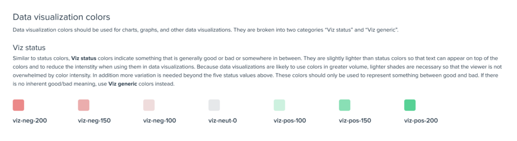
One of the most frequently used data visualizations at 15Five is some variation of a good/bad chart. These visualizations might be showing data around employee engagement, employee performance, pulse scores, or statuses of goals but they are all basically trying to communicate whether things are good or bad. Our original color scheme used green and red (the natural choices) but needed a few tweaks to improve readability, accessibility, and portability. I also wanted to make sure our new colors would fulfill these requirements:
- Useable in both bar charts and heat maps
- Able to have typographic labels appear over the colors
- Subtle enough that they would not overwhelm the viewer in areas where many visualizations are shown together
- Clear enough to standout from each other
To aid in achieving these goals, I created a Figma document with our current color schemes and several example charts and then duplicated those charts across 3 different potential color schemes. I mapped each set of charts to their own set of Figma color styles so that they could be adjusted easily. I also made sure to use charts that looked as realistic as possible, showing varied sets of data so that the charts didn’t look too tidy.
Below is a screenshot of the Figma document I made to do the evaluations:
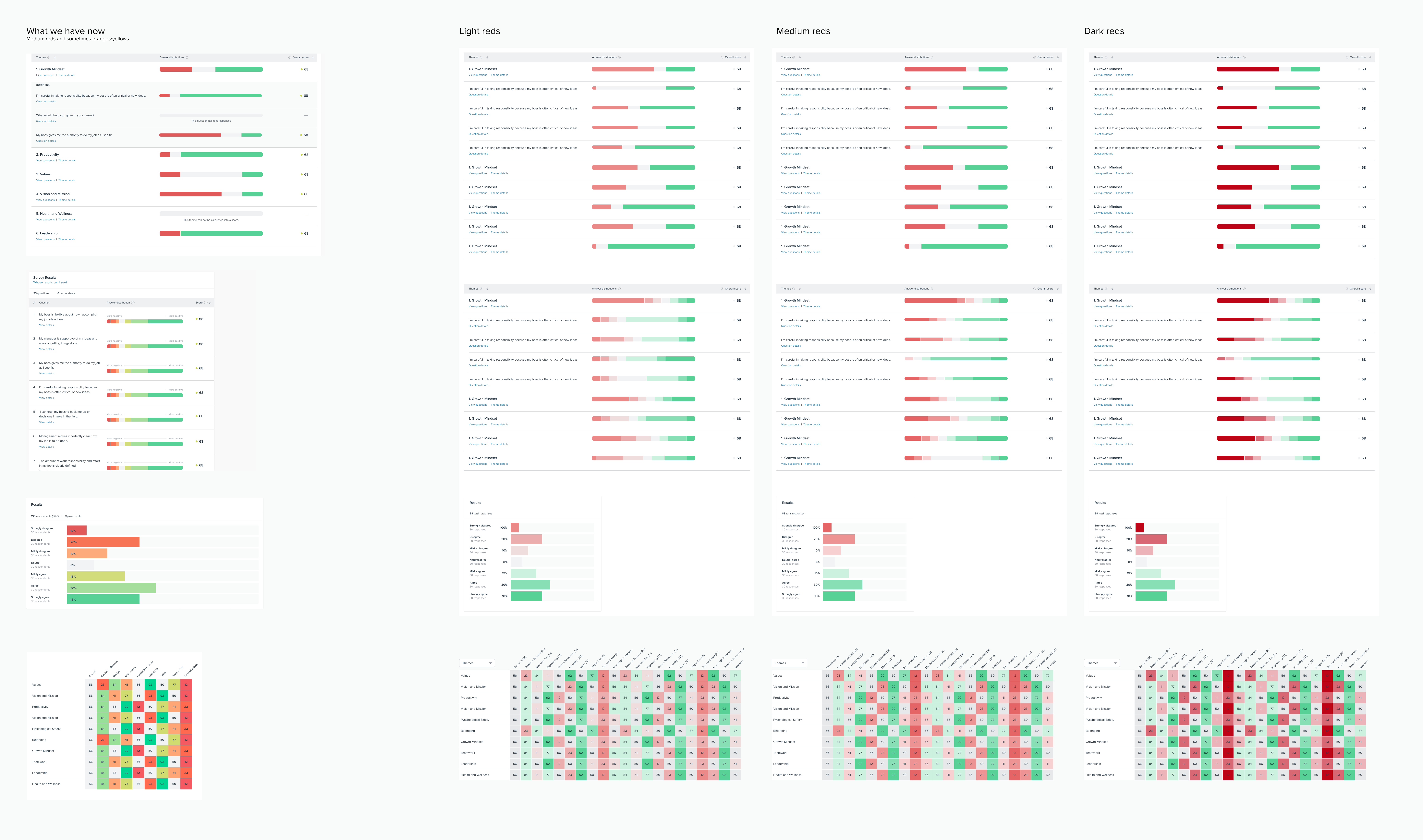
Putting the colors in this context was extremely helpful for determining an appropriate set of colors before we rolled it out to all our visualizations. For instance, the dark reds work fairly well in the expanded horizontal bar chart (3rd from the top) but are overwhelming in the heat map (bottom charts).
After some adjustments, I was able to come up with these seven “status colors” and added them to our Figma design library, shown below, along with some guidance on how to use them.
Establish standardized chart styles
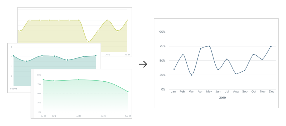
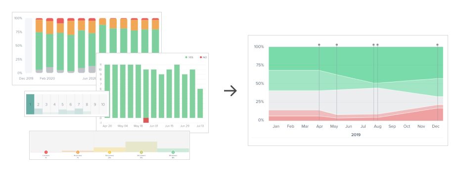
The next problem to tackle was the inconsistency of data visualizations. Even though we were using only 5-6 types of charts, we were representing them in 10-15 different ways causing inefficiencies in code and inconsistency in user experience. Below are three of our most common data visualizations, showing a before and after of each.
Variation over time
A basic line chart showing variation over time is something we used a lot at 15Five, but we had many different ways of showing the same basic information. As you can see, line charts were using a variety of solid fills and gradient fills as well as several different arbitrary colors. I recommended a line chart design with a single color and no fill (to reduce chart clutter).
Tabular data
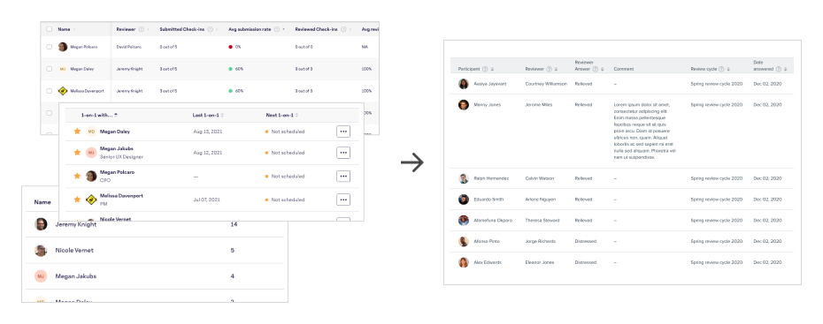
Data tables are used extensively at 15Five to display employee data. I did an inventory of our existing tables and made several improvements:
- Allowing header row labels to wrap to two lines. Previously our header row labels were all forced to be a single line of text. This caused columns with long labels to be unnecessarily wide and thus caused our tables to be much wider than needed, often times forcing the user to scroll sideways to view all of the content.
- Standardized date formats.
- Set a standard for alignment. Previously some columns were left-aligned, some centered, some right-aligned, without much rhyme or reason. I set a standard of left-aligned text in all columns except numerical content which was right-aligned.
Part-to-whole comparisons
Another common user need in 15Five data visualizations was answering the question “What percentage of our employees are X” where X might be “under performing,” “having regular 1on1s,” or “feeling engaged.” These questions are best answered with a part-to-whole chart. A pie chart is one example of this, but pie charts have many weaknesses which make them unsuitable for this purpose, most notably they do not allow the viewer to compare these percentages over time. For instance, “Is the percentage of high-performing employees increasing over time?” I created several part-to-whole chart types to help set a standard that would perform great in any circumstance and allowed our users to easily answer these types of questions.
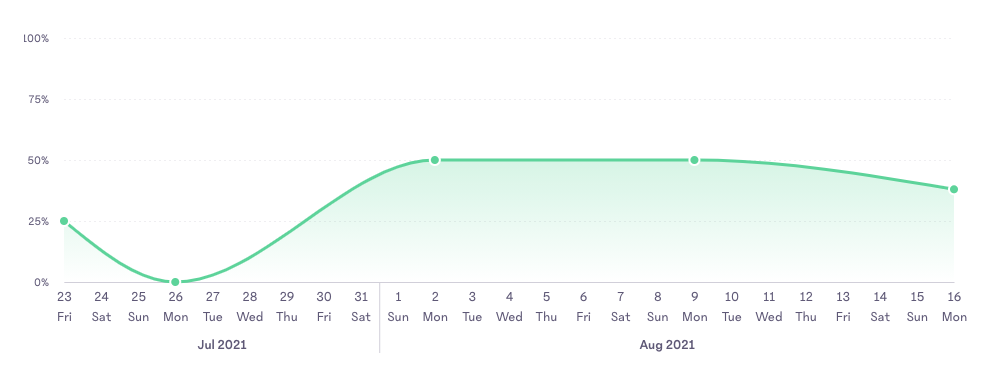
Establish intuitive time-axis labels
One of the most frequent graphs employed at 15Five (and in the world at large) is a line chart showing changes in data over time with labels along the bottom x-axis indicating dates. Coding a component for this to display this date axis is challenging because it needs to be flexible enough for a wide variety of time scales. A line chart could be showing a span of a few days, several months, or many years. Most chart visualization tools struggle to display this in a way that reduces clutter and repetition while also being intuitive to the user.
Common pitfalls of time-axes:
- Unnecessary repetition of labels:
In a time series of “Jan 2020, Feb 2020, Mar 2020, Apr 2020” there is no need to repeat “2020” for each label, it adds clutter to the chart and inhibits comprehension of the data. - No delineation of major calendar milestones:
If a time-axis spans more than one calendar year, it should mark the new year in some obvious way, such as with a vertical line. - Not abbreviating months or days of the week:
There is no reason to spell out “February” when “Feb” is just as comprehensible and more compact. Same goes for days of the week: “Tuesday” vs “Tue.” - Crowded labels:
When pitfall #1 and #3 (repetition and abbreviation) are there, it usually results in crowded labels and/or labels being omitted to save space, such as skipping from “January 2020” to “April 2020.” Another manifestation of this issue is the use of slanted or vertical labels which are more difficult to read.
Like other data visualization tools mentioned above, 15Five’s time-based charts also suffered from some of these issues, but I knew we could do better. If you’d like to read more about this project, check out my dedicated write up Designing a better date axis.