Background
While working at the boutique digital agency East Coast Catalyst, I was lucky enough to work on some funnel optimization for UC Berkeley’s executive education site. The purpose of this site is to get visitors (typically mid-career executives) to register for courses that will augment their business management skills.
Hypothesis
As part of a larger site redesign project, we did some basic user testing on the site’s conversion funnel, trying to identify how people used the site to find courses, where the friction was, and what we could do to increase conversions.
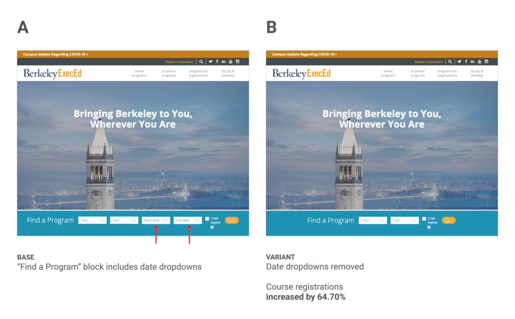
One thing we noticed as part of user testing was that users were primarily using the “Find a program” block to search for courses. This block consists of several dropdown form fields for Topic, Type, Start Date, and End Date. None of the fields are required to view the course listing but users assumed they were. The date fields were especially troubling for some because people would put in very narrow date windows and then would be shown no results on the course listing page.
Because the date fields were inhibiting users ability to discover courses of interest to them, we hypothesized that removing them could reduce friction and ultimately lead to increased course registrations.
Results
We ran the experiment for 8 weeks, with a total of 13k visitors in both variants. Our primary goal course registration increased 64.70% in the “B” version of the test.

Learnings
This is a really great result and I think it shows the power of using user testing to help inspire ideas for A/B tests. These two tools work really well together. User testing can often tell us the why where A/B testing can only show us the what.
This experiment is also a good reminder that we should be judicious in how much we ask of a user, because often the more form fields we put in front of them, the more likely they are to abandon their task.