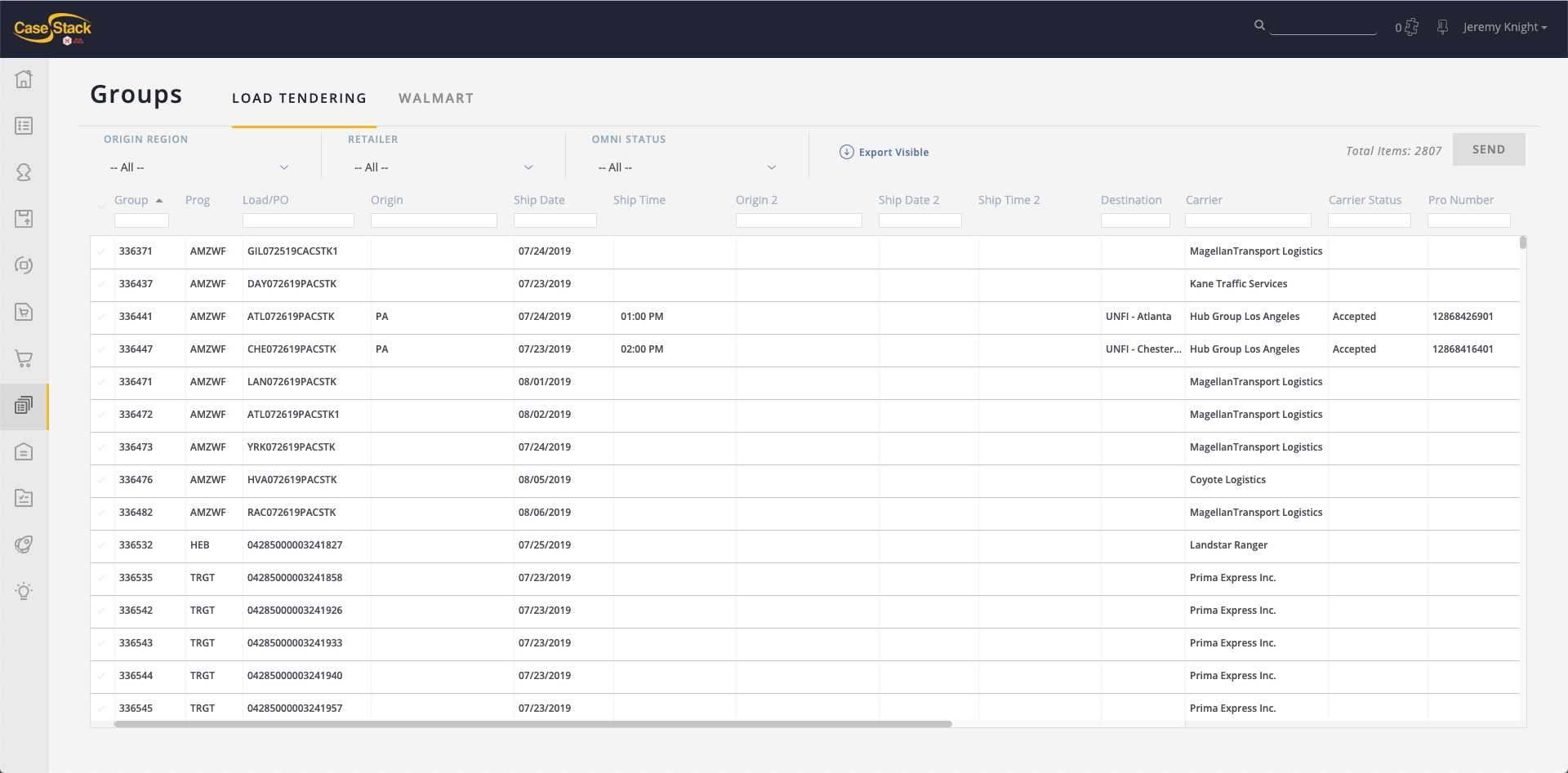
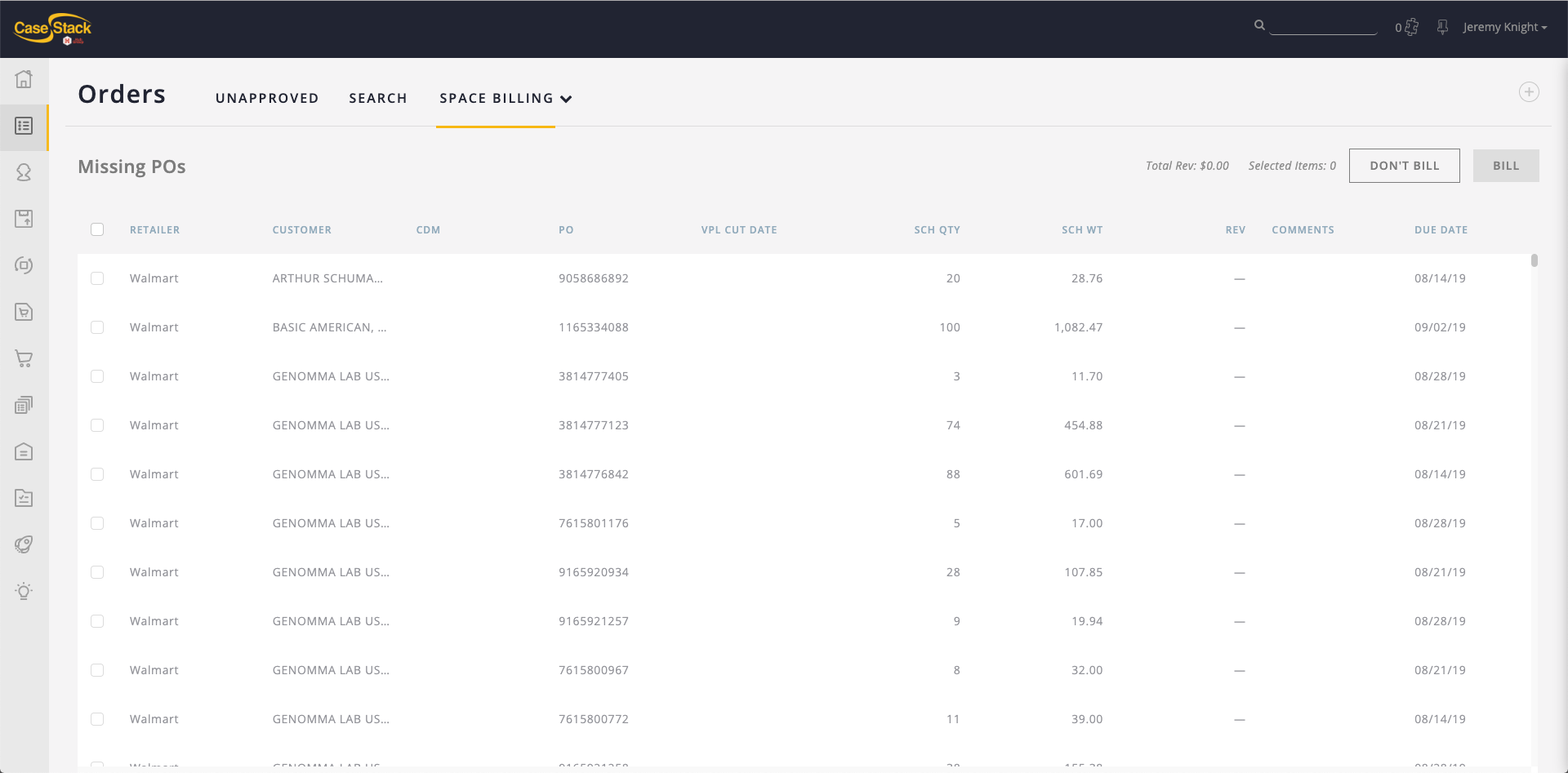
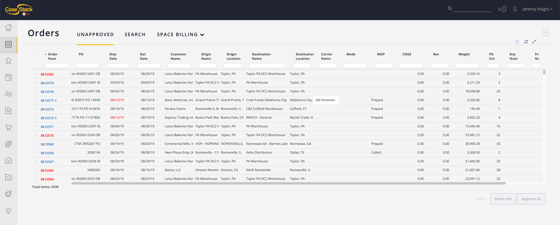
Not long after joining CaseStack to lead their design team, I started to realized how many of our products were, at their core, data tables. Whether we had lists of invoices, lists of orders, or lists of shipments, they all seemed to take the form of some sort of data table. Despite how many of our products fit this category, I was surprised to find that we did not have one reusable table component in either our design language or our code. Some tables had sorting functionality, some had limited filtering, some had search, but none had everything we needed to allow our users to fully utilize the data contained within the tables in an efficient manner. As part of our design system overhaul, I took on this project as my own.
Step 1: What do we have?
First, I did an audit of the tables we had and made notes of what was missing.

Step 2: What do we need?
After looking at our existing tables and observing how our users worked with them, I came up with a short list of key features which would allow users greater flexibility, efficiency, and clarity when using these types of products.
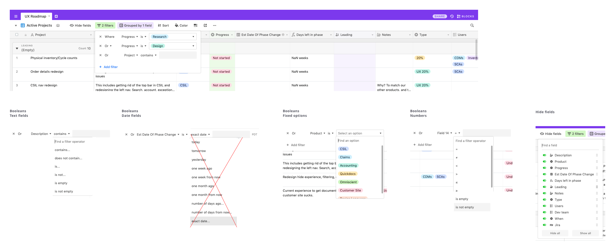
- Filter by any column: The ability to filter existed in some of our products, but how it was designed and implemented varied.
- Groups of filters: Chaining together multiple filters really gives the user a great deal of power in finding what they need. With multiple filters you can get a table to display things like, “All the invoices from Client A, whose value is greater than $X, from July 1st until today.”
- Save groups of filters as a view: Adding on to the above two features, the ability to save a group of filters and recall it later can help if you tend to apply the same types of filters over and over again. It can also help when it comes to sharing that view with a colleague.
- Bulk actions: Selecting multiple rows and applying actions to them in bulk saves time and is a common practice in our products and also external products like Gmail, Dropbox, and WordPress.
- Hiding and reordering columns: As you can see from some of the screenshots above, sometimes there are just too many columns to display in one screen. Allowing users to hide columns and reorder them allows them to see just what is relevant to them in one screen.
Step 3: What best practices exist?
With the key functionality in mind, it was time to survey the landscape and see how others were solving these problems. Borrowing ideas from popular sites is a great approach because it increases the likelihood that our users are already familiar with the solution. Also a larger site has probably already tested their approach with designers and users. Both of these give us an advantage over creating a new idea from scratch. Here’s a sampling of what I found:
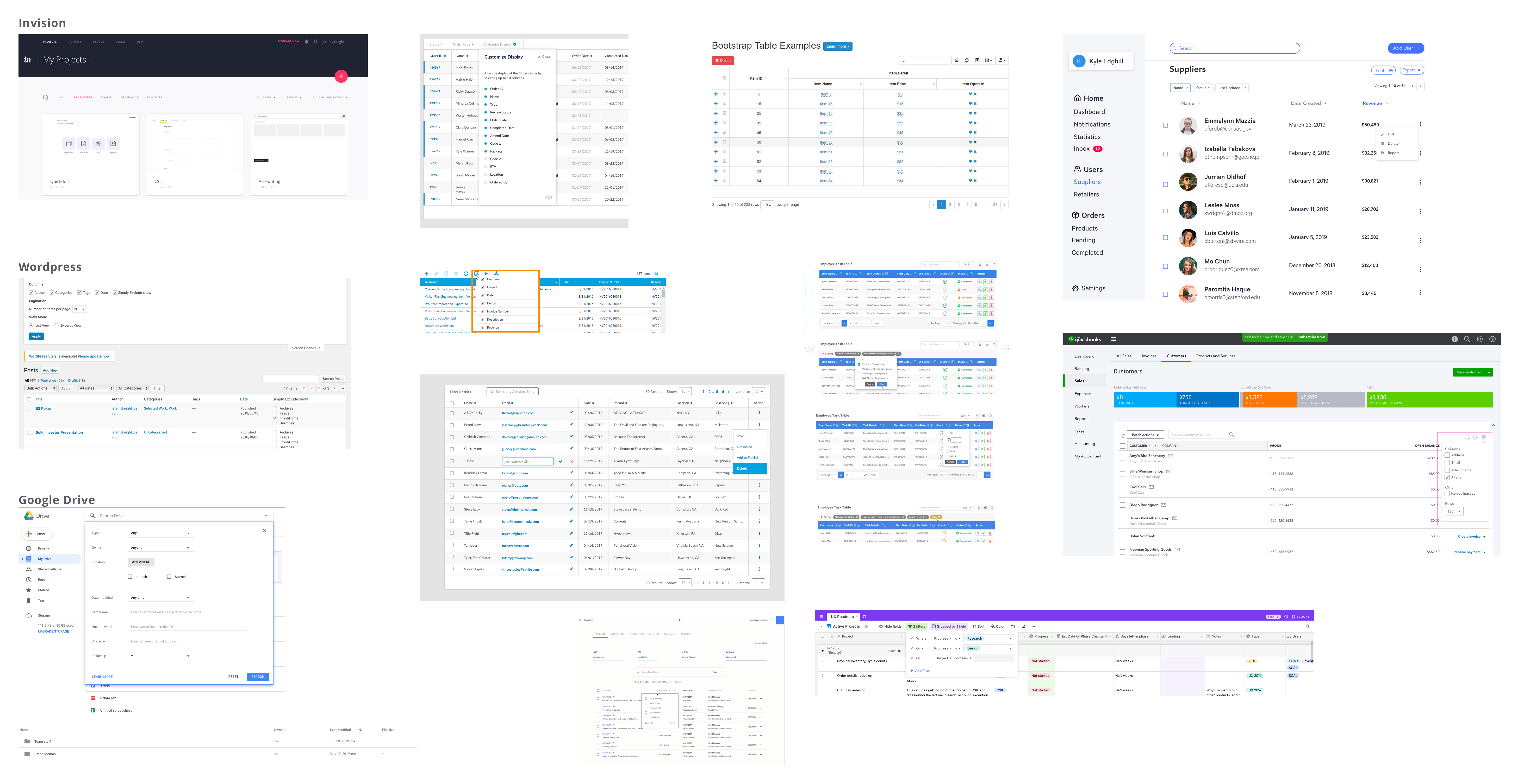
Airtable
Airtable is an app that deserves special mention because its design solutions apply directly to what we were trying to do and their solutions are executed quite well. Here’s a quick look at what they had to offer:
Step 4: Feedback on external solutions
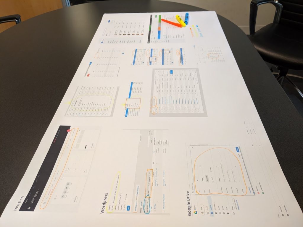
Before mocking up my own solutions, I thought it would be good to get feedback from the team about the designs I found out in the world to see if they were in agreement with me about what worked well and what did not. I made use of our large format printer to print out everything I had found and we gathered in a meeting room to talk about each item and make notes.
Step 5: Designing our solutions
Now that I had some ideas about what worked well and also feedback from other designers, it was time to make my own designs that worked for our specific needs and matched our existing visual style. After a few rounds of feedback from the designers and others, we settled on these solutions for our key functionality:
The default table view
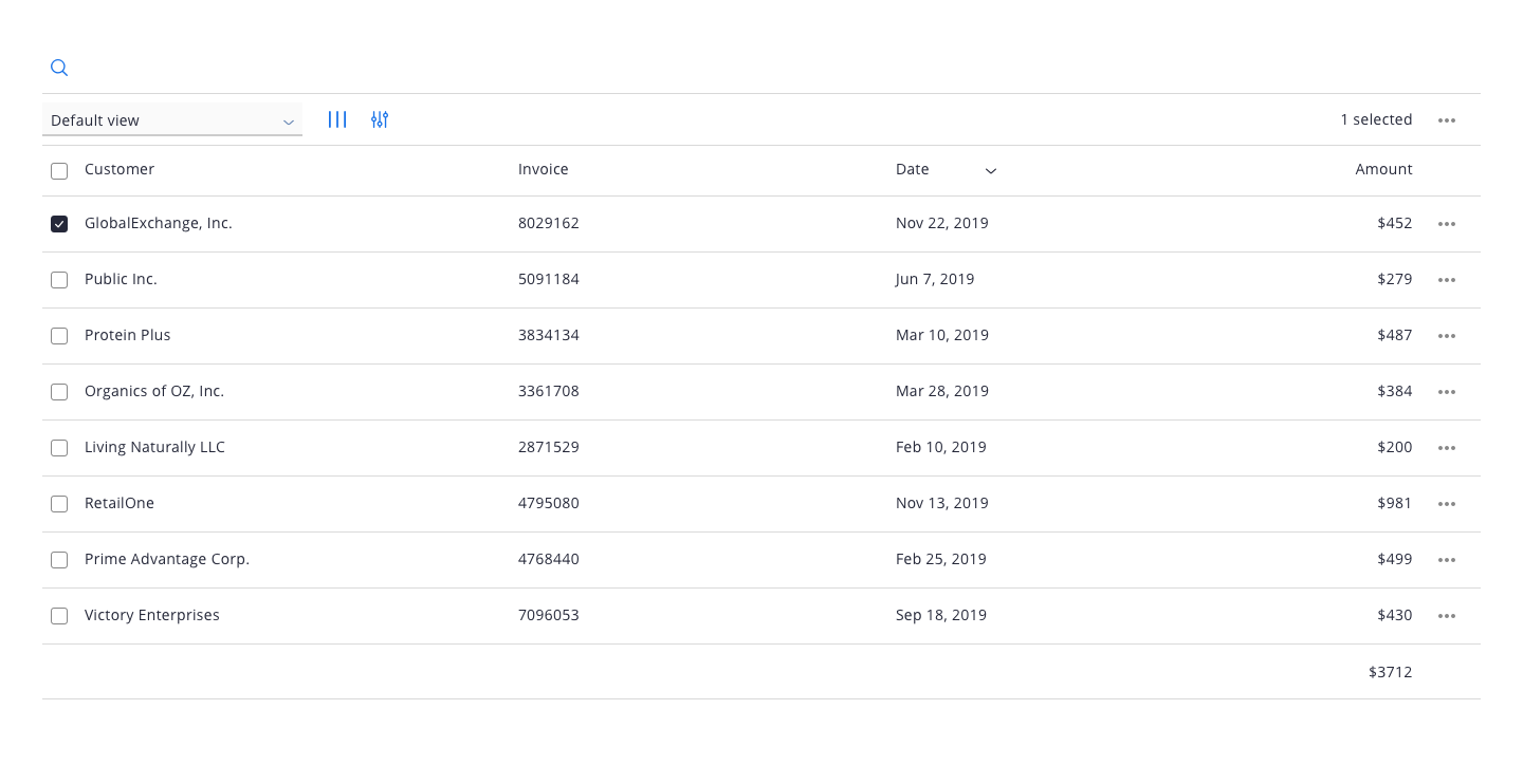
The default table view.
Adding a filter
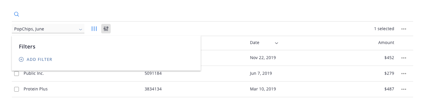
Adding a filter.
The filters box with filters applied
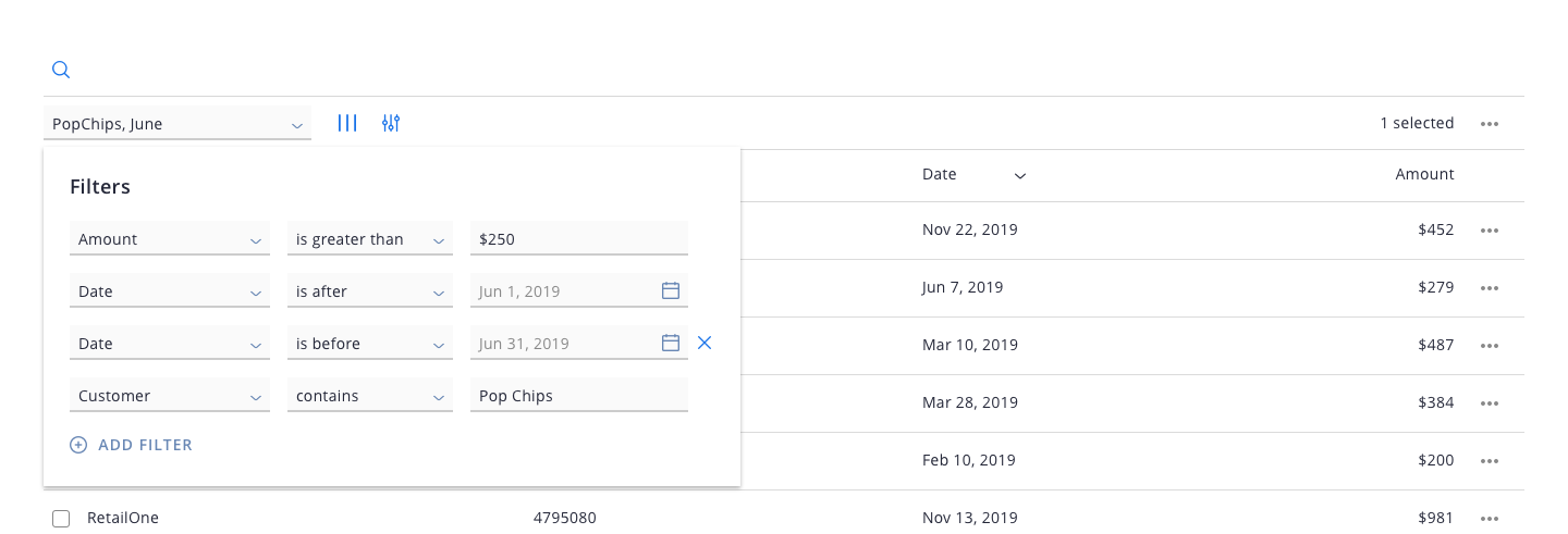
The filters box with 4 filters applied.
Saving and loading views
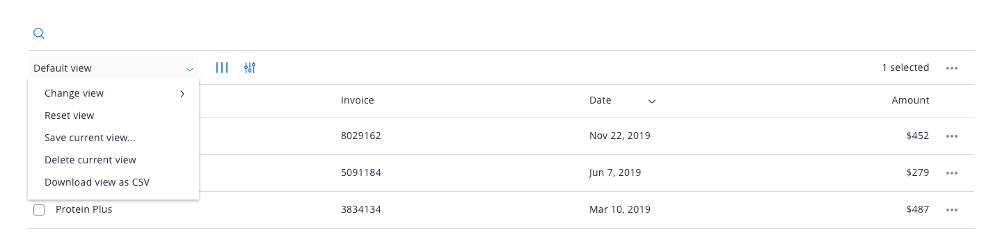
The view menu where new views (sets of filters and columns) can be saved and loaded.
Hiding and reordering columns
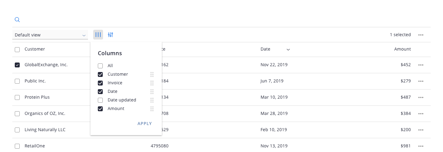
The columns menu, allowing the user to hide and reorder columns.
Our users have a high degree of familiarity with our products. In most cases, they use them every day as part of their jobs. This allowed me to be a bit more minimal, less explicit, and a bit more refined with my approach. While some of the tools we surveyed needed to be much more explicit (for example, adding words like “Filter by” next to the filter icon) we had the luxury of using simply the icon, knowing that our users will be using it so often that the extra explanation is probably not necessary. The true test will be in our upcoming user testing.
Prioritizing features
With the designs solidified, it was time to decide what to tackle first. First I walked through the designs with our UI developers so they could understand each feature and ask questions. Then I made a list of each feature in a shared spreadsheet. The sheet had 4 important columns:
- Feature name
- Desirability: a 1 to 10 rating of how much our users would want it
- Difficulty: a 1 to 10 rating of how difficult it would be for our developers to build
- Priority value: the Desirability minus Difficulty (a value from -10 to 10) that gives us an idea of the low hanging fruit or easy wins with the most value.
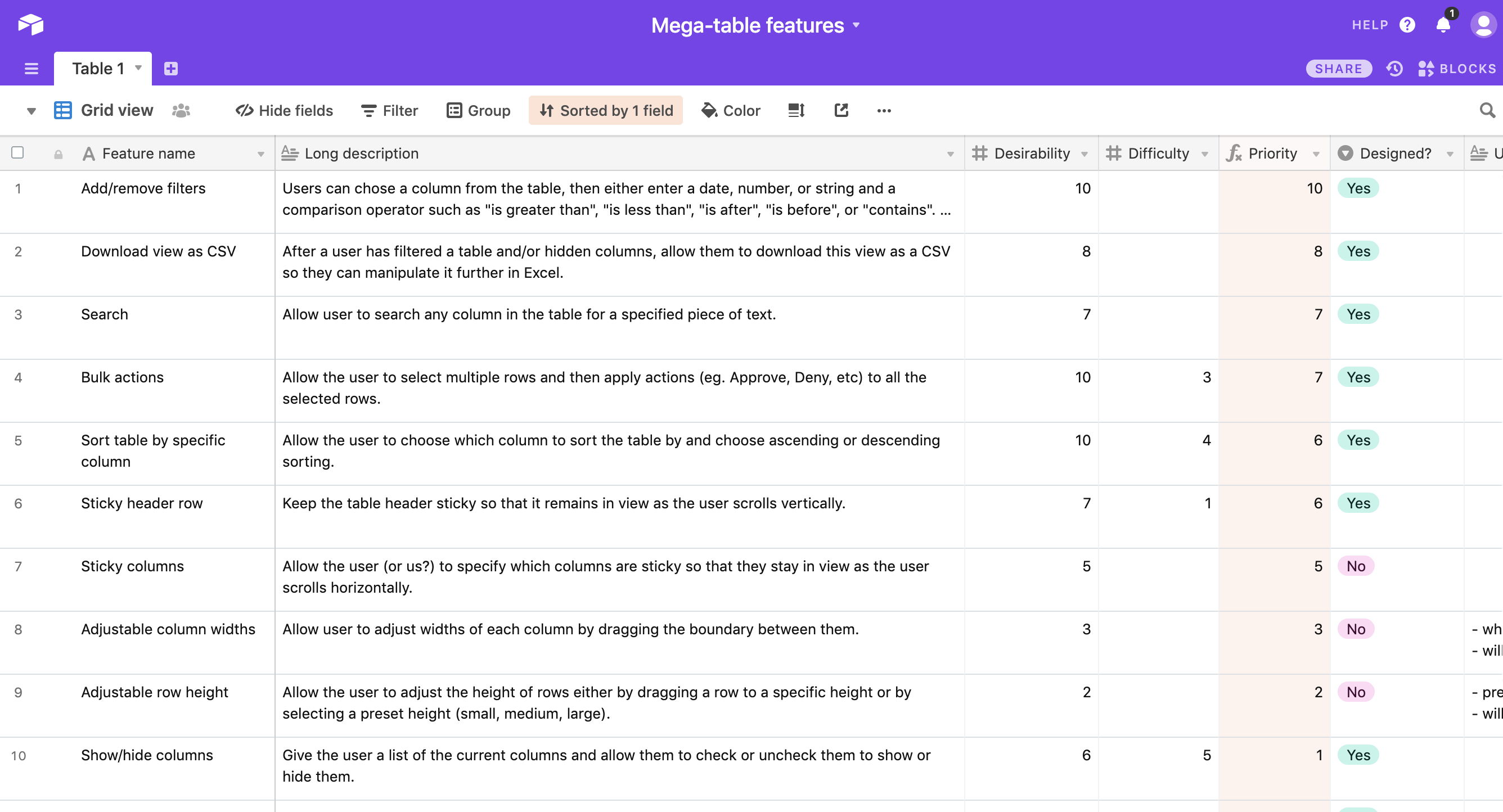
The feature priority list which combines desirability and difficulty to calculate what are the easy wins.
What’s next
At the moment, our dev team is calculating a few remaining “Difficulty” scores. But once done, we will have a list of features to build in an order that will gain us the most value for the least effort. Once we have a solid feature set, we can start implementing this table in our upcoming products, giving our users the flexibility to view the data tables in a way that makes sense for them. It will also speed up both design and development time as we will be able to quickly design and implement data-rich tables without re-inventing the wheel. If you want to learn more about this project, please feel free to reach out. Thanks for reading!