When I started at 15Five, they had almost no design system in place and my job was to create one from scratch based on their existing design conventions and to maintain it going forward. Luckily this was not my first design system, so I could borrow from past projects to optimize efficiency. This project had some unique challenges compared to other similar projects I’ve worked on in the past.
- Remote workforce: Most employees (including designers) work remotely so we would not be able to gather in one room around a big printout as I had done in past projects.
- On my own: The designers were busy on their squads, so I would be doing all the heavy lifting in terms of auditing, designing, building and managing the project.
- New tools: We decided as a team to make the switch to Figma before work began on the design system. So I would need to ramp up quickly on a new tool while doing all of the regular design system tasks.
Figma?
The first question we needed to answer before any real work could be done was “Is it time to switch to Figma?” Up until this point, 15Five designers had been exclusively using a Sketch/Invision workflow but I had heard good things about Figma and it felt like a lot of design teams were making the switch. It was not a decision to be take lightly, so I sent out a survey to the design team to measure both their enthusiasm for Figma and their level of expertise.
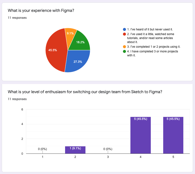
The survey indicated that enthusiasm was high for making the switch and we had a fair amount of people with experience, so I made the case to our VP of Design and she authorized us to make the switch.
The only problem at this point was that I had just committed to using a tool that I was not as experienced with. But the Sketch-to-Figma transition was really smooth and the pros of Figma (especially for a remote team) far outway the cons.
The Audit
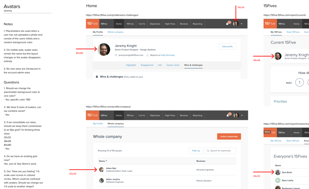
Because a large portion of 15Five’s workforce is remote, this audit would need to be done in a way that allowed all our designers to contribute even if they were not in the same physical office. Instead of relying on big printouts as I had used on other projects, I decided to create a standardized audit template in Figma. The essential components of this template were:
- Name of the component
- Name of the person auditing (usually me)
- Notes section for jotting down observations made during the audit process.
- Questions we needed to resolve.
- Screenshots of every page of the 15Five tool highlighting instances of each component and pertinent details.
Here is an example from part of one of these audit templates:
Transparency & Collaboration
Although I was the person doing most of the audit and design work for the design system, we still needed to make sure that all designers and developers could contribute feedback and see what components were in what state of development. We used a few tools to facilitate this.
- #design-system Slack channel: This channel was for designers, devs, PMs, and anyone else who wanted to be part of the design system conversation. As components were designed, I posted them here for feedback.
- #design-system-devs Slack channel: This channel was for me and any developer that had opted in to work on coding design system styles and components.
- JIRA board: This board was for tracking the status of components as they went through various phases of design and development. One ticket might correspond to one component, a modification to an existing component, or other design system tasks.
- Bi-weekly meetings: Every 2 weeks I met via Zoom with designers and devs and walked through the latest components. We also used this time to ask and answer questions.
- 1-on-1 consultations: As needed, I would also schedule 1-hour sessions with designers to go through their latest Figma files and offer suggestions on ways to optimize their workflow and make better use of design system components.
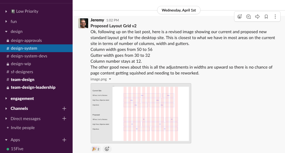
Design system slack channel 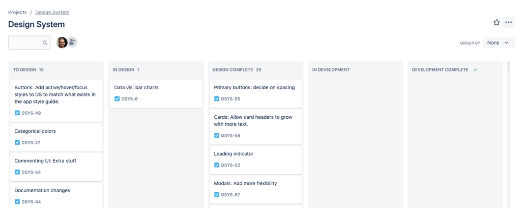
Design system JIRA board
Foundations
Before jumping right in to components such as input boxes, buttons, etc, it is important to establish the foundations on which the design system is built. Colors, typography, spacing, and icons were the foundational elements that all our work is built upon. Some of these elements had been created before I arrived, and so just needed to be documented. With colors it is especially important to document not just what colors should be used, but also how and where colors should be used. For spacing, we established a general guideline that all things should adhere as much as possible to 8pt increments with the exception of line heights which work better in 4pt increments.
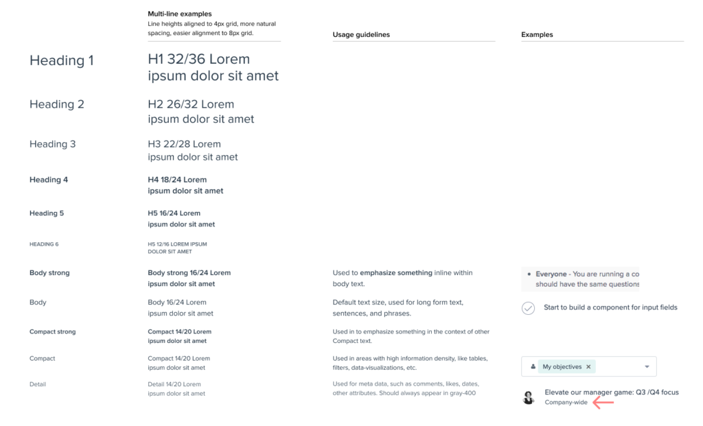
Typography foundations 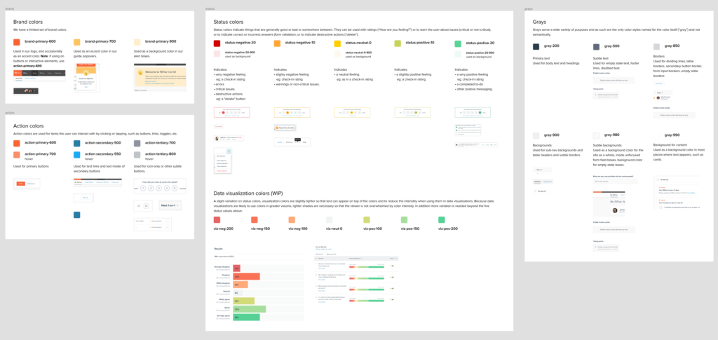
Color foundations
Components
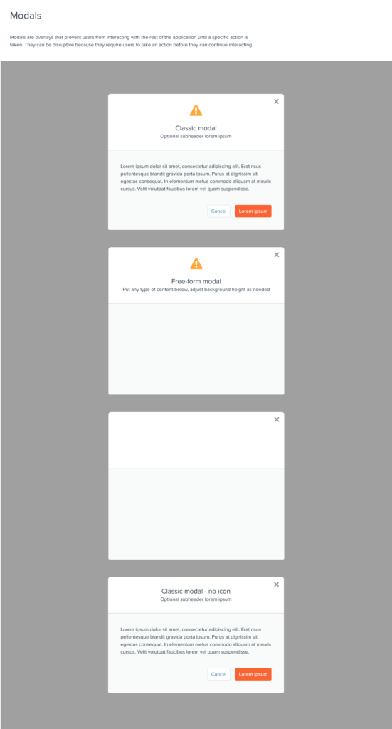
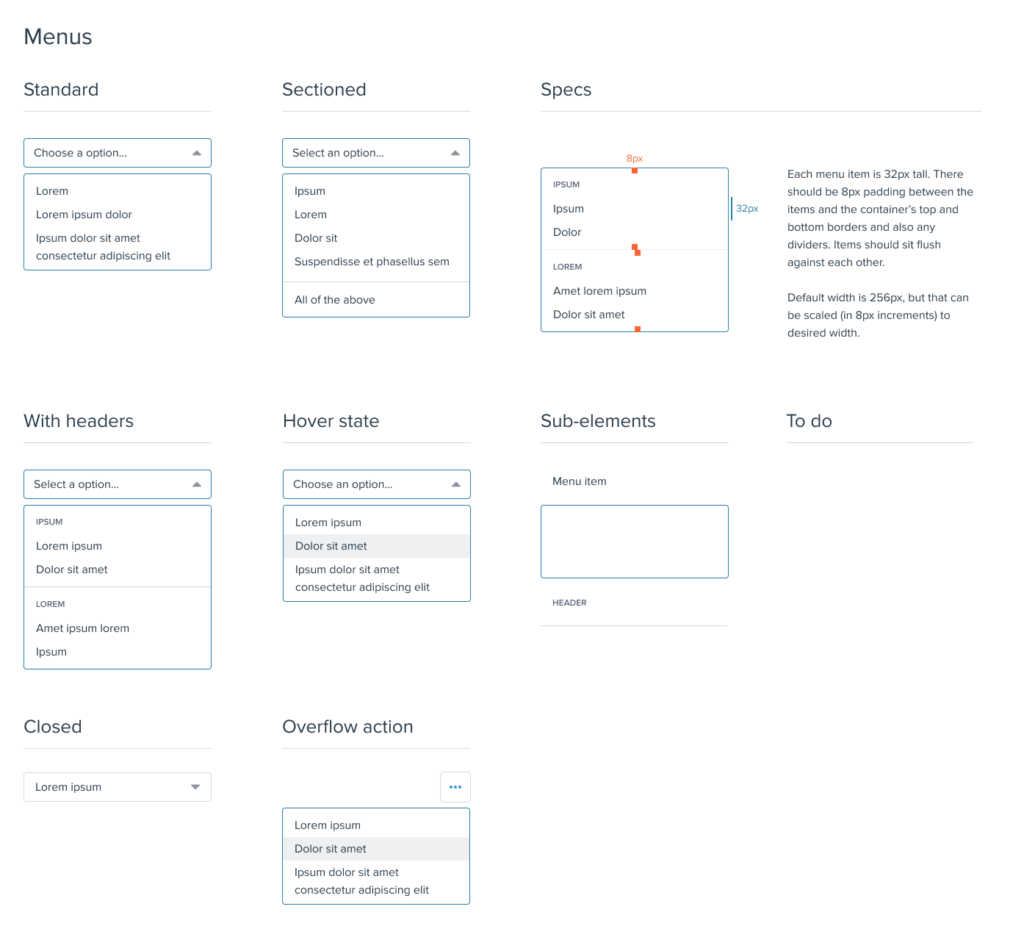
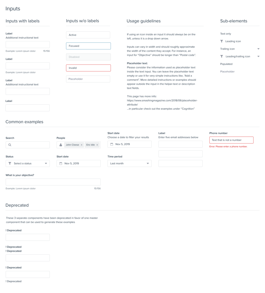
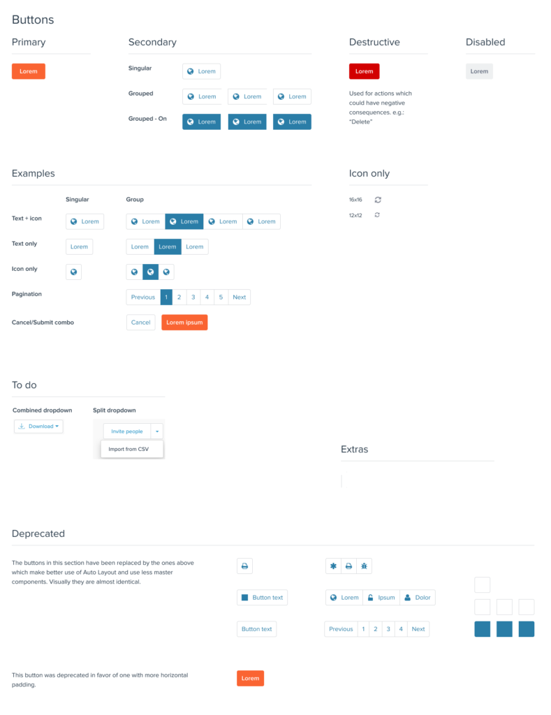
In about six months, I was able to create a robust set of components based on existing 15Five design conventions that I would estimate covered about 80% of use cases. I surveyed designers about what components were most urgently needed and used that list to establish priority – working on the most needed items first. Here are a few samples of what I created including Buttons, Inputs, Menus, Modals, Cards, and Data Tables:
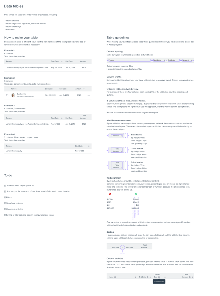
For some components, usage guidelines were self-explanatory, but for others (like Data Tables) I provided more detailed usage info.
Observations & next steps
The trickiest part of this process is aligning the design system with what is developed in code. This is one of the reasons I established a dedicated #design-system-devs Slack channel to track development progress. I think there will always be a bit of a mismatch, but it’s especially difficult during the beginning stages of a design system. The advice I give to designers is to communicate early and often with your devs. Show them the components you plan to use and talk through any implementation issues.
Going forward we will continue to design missing components, facilitate the development process, and respond to designer and developer requests for additions, changes, etc. It is important that everyone feels their voice is heard and everyone understands the decisions we make as design system owners. Design systems, by nature, come with restrictions and limit the designer’s freedom. It’s important that the designers understand this, but also that they feel empowered to suggest changes. The designer is on the front line of product development, so their perspective needs to be respected if a design system is to succeed.
