I have a strong passion for A/B testing and I have been lucky enough to hone my skills in this area while at Booking.com. Here I learned the advantages and pitfalls of using iterative A/B tests to inform design and product decisions. During my 4 years there, I personally created over 230 experiments of which 93 were conclusively positive, many of which were related to improving the collection of hotel reviews, city reviews, and landmark reviews. I’ve also created a number of experiments for other companies as well. Below is a sample of some of these experiments, click on any of them to learn more.
Booking.com:
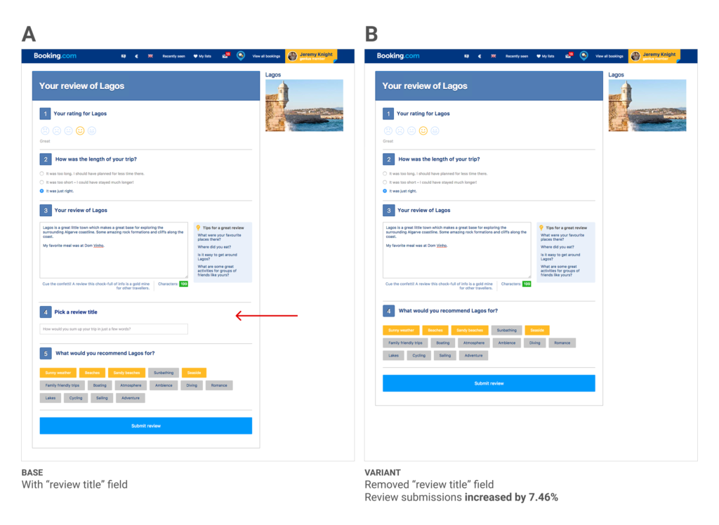
Hide form field on review
The experiment below focused on the city review form where a user would review the city they visited and provide other helpful information to their fellow travelers.
We ran the experiment for one full week, with a total of 900k visitors in both variants. Our primary goal, city reviews submitted, increased 7.51% (± 0.30%) in the “B” version of the test. In short, it was a definitive win.
Booking.com:
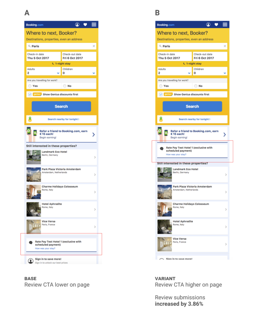
Move review CTA
This experiment focused on users who had recently stayed at a hotel but had not yet written their hotel review – specifically users who were visiting the site on a mobile device.
We ran the experiment for four weeks, with a total of 179k visitors in both variants. Our primary goal, hotel review submission, increased 3.86% in the “B” version of the test.
Booking.com:
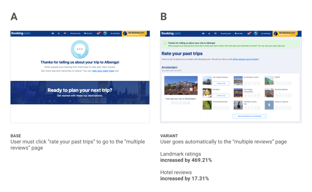
Remove step from review flow
This experiment focused on driving traffic to the “multiple reviews” page which lets users review and rate hotels, cities, and landmarks from all of their past trips, not just the most recent one.
We ran the experiment for one week, with a total of 678k visitors in both variants. Because of the nature of this page we had many goals to track for both ratings and reviews of hotels, cities, and landmarks. Here are a few of the key metrics we moved:
- Increased ratings of landmarks by 469.21%
- Hotel ratings increased by 17.31%
- Hotel reviews with text increased by 16.36%
Booking.com:
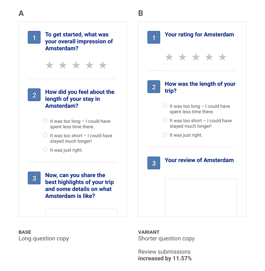
Shortened form copy
This experiment focused on the form we used to collect reviews of cities after a user’s trip.
We ran the experiment for 1 week, with a total of 292k visitors in both variants. Our primary goal, city reviews submitted, increased 11.57% (± 0.63%) in the “B” version of the test.
Booking.com:
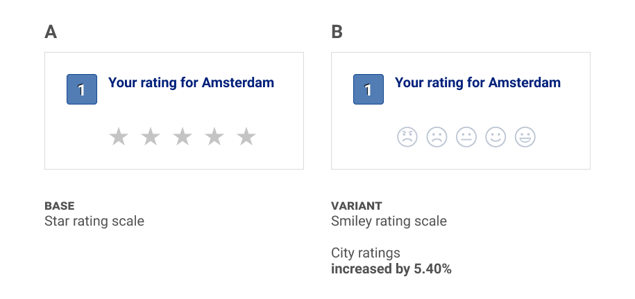
Changing rating icons
This experiment focused on the form we used to collect reviews of cities after a user’s trip.
We ran the experiment for one week, with a total of 771k visitors in both variants. Our primary goal, city reviews submitted, increased 5.40% (±0.35%) in the “B” version of the test.
Booking.com:
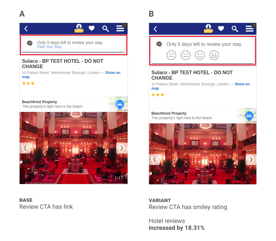
Improve review CTA on hotel page
This experiment focused on users who had recently stayed at a hotel but had not yet written their hotel review – specifically users who were visiting the hotel page on a mobile device.
We ran the experiment for four weeks, with a total of 125k visitors in both variants. Our primary goal, review submissions, increased 18.31% (± 2.39%) in the “B” version of the test.
UC Berkeley:
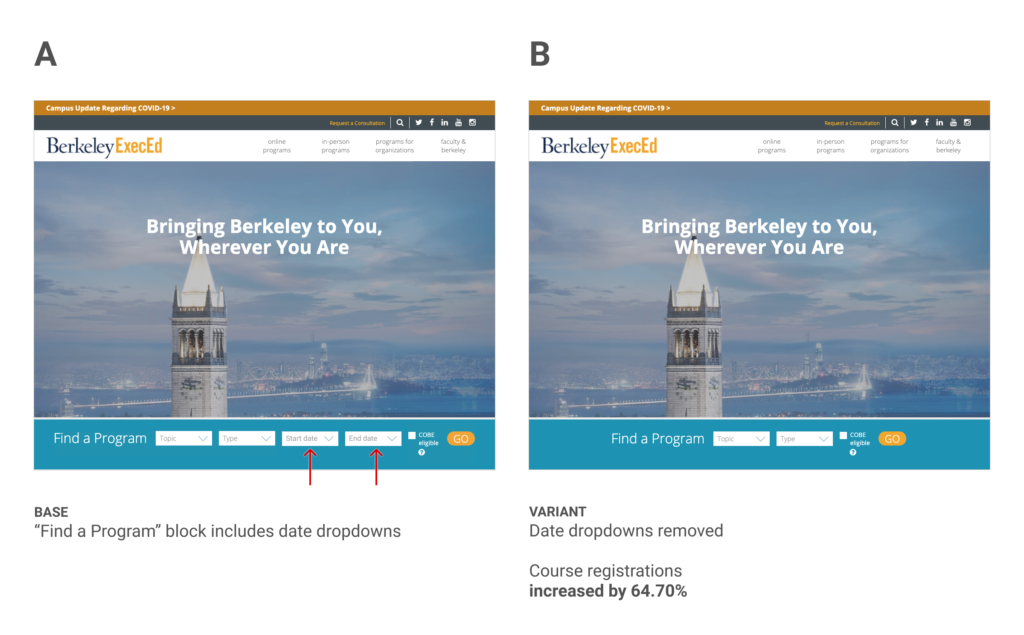
Removing form fields
In this experiment, we hypothesized that removing some form fields could reduce friction and ultimately lead to increased course registrations.
We ran the experiment for 8 weeks, with a total of 13k visitors in both variants. Our primary goal, course registrations, increased 64.70% in the “B” version of the test.
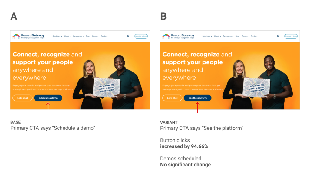
Reward Gateway:
Hero button copy change
This experiment focuses on the hero area of the Reward Gateway home page and the primary CTA button in that area.
This experiment ran for 8 weeks and received 13k visitors in both variants. Our primary goal was an increase in scheduled demos and unfortunately we did not see any meaningful impact on this goal (positive or negative). Interestingly though, we did see a 94.66% increase in visitors clicking this button.
